The author says:
This is a remake of the cover for this book, which hopefully is better than the first. Book info remains the same: A middle-grade satire about government and digital security in the U.S. involving an evil Santa Claus. It’s mainly humor/satire with fantasy and some sci-fi elements, set in a future Canada where Santa is real and runs a global Christmas operation. It is NOT dystopian by any means. It’s just normal Canada with some slight interference from Santa’s surveillance department.
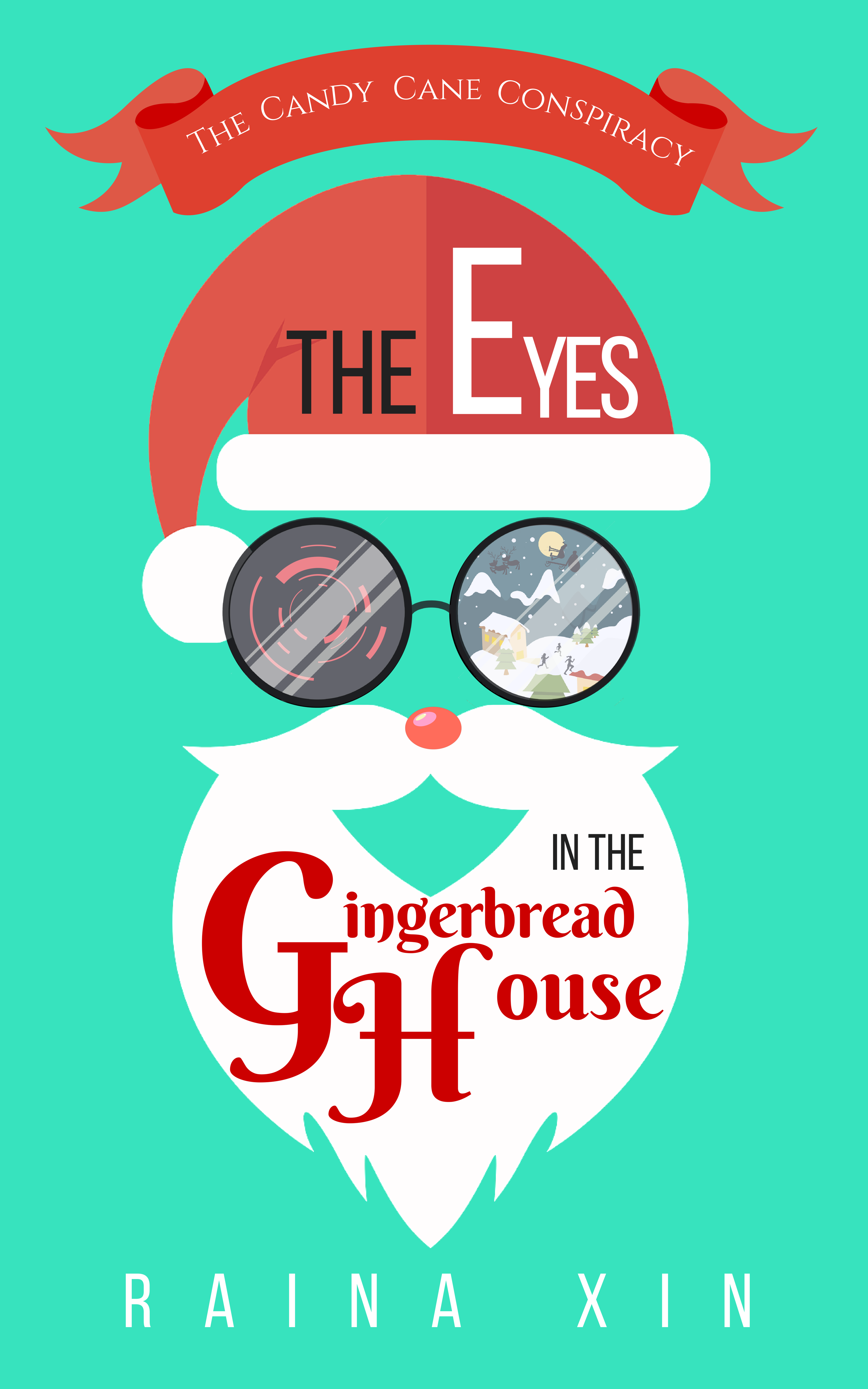
One line pitch: After a school trip to the North Pole goes awry, revealing some unpleasant truths, a twelve-year-old aspiring journalist and her friends must find a way to bring down Santa’s global surveillance operation.
I know this doesn’t look like traditional MG fantasy covers, with a painted scene from the story in a frame, but I thought that since the story is slightly different from traditional MG fantasy ones (because of the satirical elements), a more modern, simple, and graphic design (as opposed to artwork) focused cover would fit the theme. The left lens is supposed to look like the view from a futuristic camera with a laser targeting/tracking/whatever system (the kind in sci-fi and spy movies that involve lots of red lines on the display), and the right lens is more or less a scene from the book. I know they probably won’t be visible in a thumbnail, but I’m hoping the general shape of the beard, hat, and slightly ominous looking glasses might entice readers to take a closer look, where they can see all of the little details. Hopefully this cover is better than the last one, and thanks for the help!
[original submission and comments here]
Nathan says:
Much, much better. I can see the Christmas vibe from 20 feet away, and the artwork is both clean and focused.
I don’t know how well confining the title to the hat/beard works. For one thing, I’m always suspicious of divided titles — the eye has to jump and quest for where to continue with what should be a continuous thought — and for another, it crowds the artwork, while leaving the teal background (that’s teal, right?) empty and expansive. I would play with cropping the artwork so that it leaks off the edge of the image, and seeing whether you can bring the title into one place. (I also think the calligraphic font for “Gingerbread House” is unnecessary, and might be overkill.)
Re: the glasses: I like the concept of the surveillance camera-eye. Remove the reflections, so that it’s clearer. You’d get more impact from that eye if you just left the other as an inert lens — “Christmas” is already well-established, so you don’t need a Yuletide scene in there to reinforce it.
I think you’re definitely on the right path here. Any other comments?
I’m getting a slightly creepy vibe out of this, which is good, I think.
I disagree about the Yuletide scene, I think it’s cute. I am a bit worried about the size of the “Gingerbread House” text. I wouldn’t go in the direction of making the artwork smaller, but slightly larger, to cover more of the green background. Make the banner on the top slightly smaller to give the “Santa” more space to expand (you can’t read “The Candy Cane Conspiracy” on the thumbnail anyway), and then make the G and H in “Gingerbread House” slightly smaller so you can make the rest of the text slightly larger. It would be nice for it to be large enough to be visible on the thumbnail. “ouse” is too far away from H. Mind you, I’m terrible at visualizing things, so it might look like total crap if you do this. Try it, see if it works, if not, just ignore what I’ve said.
I’m also not sure about the tone of the green background. It looks kinda fresh, so that’s good, but it also looks kinda pale? It is an eye catcher, though. What do you people think? A shade darker?
Overall, I like the cover. Even the broken up title Nathan dislikes. It’s imaginative.
You’re getting where you’re trying to go, but you’re not there yet. The main flaw that immediately leaps out at me is the garish shade of cyan you’ve got in the background; what’s Christmas-y about that? While working on an alternative background, I also noticed that some of the elements had clearly been sized up a bit from their original form, given away by the roughness of the pixels around the edges. These flaws don’t show on the scaled down versions of your cover that actually fit my monitor, but that only leaves a question to be begged: why do you even need a cover 5,000 pixels high? Half that would be more than enough resolution for any monitor smaller than a home movie theater screen.
In any event, I’ve redone the background of your cover and uploaded my experiment to Tiny Pic (which automatically reduced its height to 1,600 pixels) so you can see what changes I recommend for yourself. Have a look, and see how my background/color scheme change grabs you.
That hurts my eyes. I couldn’t look at it for longer than a few seconds.
Sorry, but that background truly hurts to look at.
Really? Candy cane striping hurts your eyes? All right, let’s see if this cover is any easier on your vision.
I like the cover very much. At first I was ready to dislike the title being broken up and in so many typefaces—but it is surprisingly easy to read.
I think the art could fill the space more, so there is less of the green background.
The camera lens almost works…you may want to fool with it a bit so it reads more immediately as to what it is (perhaps think more “HAL”). I am a little ambivalent about the other lens, with the Xmas scene in it. It’s probably a little too busy and small-scale to really convey anything. If you want to show the reflection of something Xmasy, perhaps confine it to a single image, such as a snowflake, a holly sprig or some such thing. Or maybe just Santa’s eye (which might make for an even creepier contrast with the camera lens).
Emma G: is that your handiwork?
Nope, not my work. But definitely a fun cover! 🙂
I still don’t really like this one. It’s an improvement, sure, but while this one doesn’t look specifically not MG, it doesn’t scream MG, either.
I don’t like the type treatment. Too many typefaces, the flouncy Gingerbread House font undermines the thrillery look, and the kerning is all over the place.
As for the illustration, are those supposed to be binoculars? Because they look like glasses, which makes me think “nearsighted Santa” instead of “surveillance Santa.” The images in the lenses are way too small and high-res, which makes them look out of place; at thumbnail I thought they were photographs. (At full size, they don’t line up correctly, so there’s that too.)
My eye keeps going to two parts of the image: The red Rudolph nose and the vertically divided hat. I can’t tell if the latter is supposed to be shading or a design element, but either way I don’t think it’s supposed to be a focal point.