The author says:
Contemporary fantasy with some horror elements.
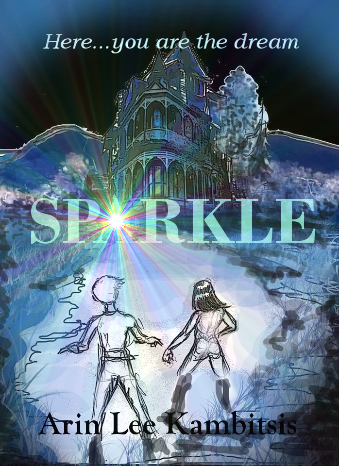
Nathan says:
Hmm. Lotta problems here, and I don’t know which to address first.
First, I suppose, is that the main image is composed of elements in disparate styles which don’t blend well together. You’ve got an over-processed (and poorly composited) photograph of a house in the middle of a digital sketch. They look like they were thrown together not by design, but by desperation.
The digital sketch is a problem by itself, because it looks just like what it is: A hasty sketch. Lord knows I love sketch artwork, but this is too scribbly to be much more than a guide for a later, more controlled rendition. And the scribbled details to either side look almost like digital graffiti — they distract without adding anything.
I could go into font choices and such, but I think you’ve gotta correct the main image before any other repairs make sense.
Am I wrong? Other opinions?
Are we sure this is the final version? To me it looks much like a layout stage in the design process.
(If it isn’t I apologize)
As purely a layout it is on a good track, it could be made into something great if you continued this through to the end.
To improve it I would place the male figure at the same angle as the female, but mirrored. This would cause perspective lines in the figures to help frame the path they are on, to draw the eye forward to the house. It would really help make the focal point clear, the house.
This house is in the right perspective to be menacing at least. The mountains are competing with the majesty of the house, I would remove them to make the house even more impressive and important.
Really focus on the lines to the house. The path, the body lines, even some dark clouds in the sky, they all should be pointing towards the house.
Purple is creepy, no doubt. But I think you need some other colours to help sell this. The path should have brown, the sides need greens, the characters can be in shadow because the light source is the house (but not flat, they need highlights).
Fianlly, some sparkle in the name might work, this is just too much for where it is located. Maybe try the title behind the house, with the sparkle centred and following the same vanishing point rules as everything else.
This has so much potential. You can do it Arin Lee!
Yeah, we need to know this before we can make any other assessments.
I dunno. The six-word description I started the post with is the entirety of the message that came with the cover.
I thought as much. 🙂
It is just that I have had layouts that look like this, perhaps it was just a personal thing.
Well, we have what we have: the description’s extremely minimalist and I certainly hope the author didn’t intend this image as a final draft for the cover. Assuming for the sake of expediency that this is a “scratch” or what animators might call a storyboard, we do have at least some clue as to what the story might be: integrating the stated genre in the description with the present elements of imagery and the tagline together as a whole, I’d infer that this is a tale of a young boy and girl examining the mysteries of a spooky old mansion that may or may not be haunted. The tagline in particular has me thinking the author may be setting the protagonists up for a Sixth Sense or Serial Experiments Lain-style twist ending in which they discover that they are the spirits haunting the mansion, or maybe that anyone who tries to investigate the mystery ends up becoming a part of it and enticing others into making the same investigation.
If this is the kind of story the cover is trying to sell, then it does have all the proper elements. Now what it needs is some serious refinement: put simply, mixing and matching styles is not going to work. Everything has to be of one style, be it two-dimensional cartoon line drawings, three-dimensional computer graphics, photo-realistic renderings run through strange filters, or a deliberately rough and scratchy sketch. Right now, the titular sparkle appears to be a 3D “star burst” filter from some kind of image editing program, the mansion and background appear to be a combination of three-dimensional rendering and scribbles run through a “painting” filter, and the protagonists appear to be deliberately rough sketches. The combination of all these different styles here does not work, and no combination of them will; the picture needs to be either one deliberately rough sketch, one painting, or one three-dimensional computer rendering.
Once the artist has picked one style, the other problem to be addressed is the font: it’s kind of boring, and suffers from legibility problems, particularly in the byline. For a fantasy with horror elements surrounding a spooky old mansion, I’d recommend either hand lettering, or something that looks like it; even slightly blotchy old-fashioned typewriter lettering might be convincing, depending on the era in which the story is set. Then pick a color that will help it stand out from the background a bit; almost anything would be more legible than the black-on-darkened-background of the byline, and the light-blue-against-darker-blues title is only barely more legible. Get something in yellow or red, or at least bright purple to stand out against those cool blues and greens of the background.
In short, Arin Lee Kambitsis, you’ve got a fairly decent start on a cover here; now process it until you’ve got a finished product.
Frankly, if this is the finished art I think you need to go back to square one. By the time all of the problems would be fixed, you’d essentially have a new cover anyway.
I have to ask as the others have: is this just a sketch? Knowing that would make a big difference.