The author says:
Experimental literature in the key of science fiction. Are you reading or being read? Are you the character or the author? Are you the created creating their creator? Ponder these questions and more as you are taken through a labyrinth of false memories, alternative timelines with an overly maternal Artificial Intelligence.
Nathan says:
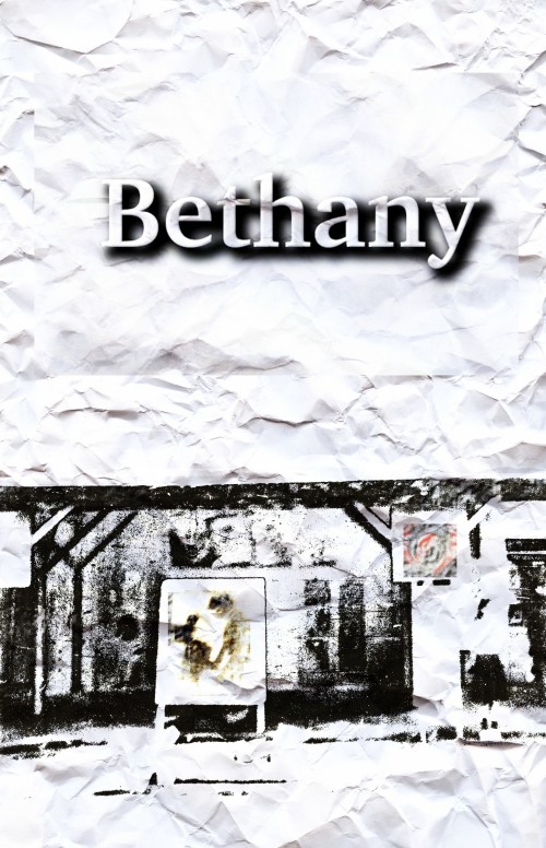
I’m in a little bit of a bind here, because “experimental literature” usually means it’s willfully obscure and isn’t meant to appeal to most people… so a cover that does just that is right on target. You can’t represent genre, story content, etc. on the cover, because the book is meant to defy expectations.
So by those standards, um… I guess it’s good.
Seriously, I’m gonna defer to the other commenters on this one.


“Experimental literature in the key of science fiction.”
That’s not the vibe I get from this cover. I see two vague pieces of art adorning the outside of a what could be a train station on crumpled paper. Throw in the title and it seems like it’s about an abstract artist named Bethany who lives downtown. She posts ads about her exhibitions on flyers that you staple to telephone poles.
Just my two cents.
As DED and Nathan both said, it’s extremely difficult to know whether this cover is representative of the content. The bigger question is: do you need this cover to appeal to the prospective buyer? If you don’t, then it really doesn’t matter, and this cover is as good as any other; and better than some.
If, however, you want your buyer to be attracted to the cover–be induced to click through–then you have to give the buyer something. Something that says SciFi–if that’s what it is–or something else. The problem with this cover is that it’s not visually appealing. At the moment, particularly in thumbnail, it looks to possibly be literary fiction, romance perhaps (or literary fiction with a romantic element). It definitely doesn’t say “sci-fi” or “experimental fiction.”
Of course, experimental fiction doesn’t have standard covers, so this cover could be EF, or any cover.
My bigger problem is that it’s severely lacking contrast, and the eye has nowhere to go. The layout creates an optical illusion that the top is narrower than the bottom.
As we don’t have a genre to fall back on, we have to simply decide that the cover itself will carry the day. To do that, it’s going to need some color, some contrast, and in my opinion, a font that is a lot more interesting than that Slab serif.
Really, that’s all I can possibly contribute. I don’t feel that this cover will help sell your story–and I’m assuming that that’s what you want (because you’re here). I think that even readers of EF like pretty things; they like the contrast of successful covers, the bright coloring (at least, to some extent) and the crisp lettering. You can probably get away with not having one of these, but not all three.
I hope that helps, although, I’m not sure how it could.
Hey, I write some pretty experimental things and I wouldn’t say it’s ‘willfully obscure’! But then, I’m on the most accessible end of it. Think Tarantino-style timelines and screwing with the idea of the fourth wall, but not much past it.
When I think ‘experimental science fiction’, the first thing that comes to mind is Philip K. Dick. Unfortunately, dying in the early 80s means your covers are not particularly applicable to a modern SF market, but I think you could still get something from them. The idea of leaning more towards the SF end of that descriptor than the experimental one stands.
Well, um, unnamed author person, I will say this for you: your cover art does match the synopsis: it’s abstract, it’s vague, it leaves us scratching our heads. I’m not sure whether that’s really a good thing, but then I’m not much of a patron of abstract art either, so I’m not exactly in the target audience. About all I can give you is general advice that’s universally applicable.
First, while I’m aware that one isn’t exactly supposed to “see” abstract art so much as “feel” it, even an abstract book cover needs some kind of focal point. The human eye is drawn to bright colors, to convergent lines, and to shiny things; your cover has none of these. Give your readers something in the middle of your cover to catch their eyes, even if it’s just a scrap of tinfoil or a Jackson Pollock-style splash painting or the like. A vague sepia poster and some faded red-and-green abstract art on a hanging paper aren’t going to be enough.
Unless you’ve got some really important reason to want to keep your name obscure, you probably should also have a byline. The font doesn’t have to be fancy, and the name doesn’t have to be real, but the author’s handle is at least as important as the title in helping readers sort the book out from others in a library or bookstore. Amazon.com, for instance, already has several books with Bethany in the title and numerous more by authors named Bethany.
Finally, while some background textures are good for overlaying with art, crumpled paper isn’t one of them. From the lack of creases in the artwork, anyone can see you’ve just taken a shot of crumpled paper and slapped a layer of artwork and a title down over it. If you really want this cover to look like something on a crumpled piece of paper, try printing your cover art out on a sheet of paper and then actually crumpling it; then you can flatten it out and scan it back into your computer for a cover that really is shot from something on a crumpled piece of paper.