The author says:
This is a psycho-drama about the eight (almost nine) year old Aaron, who’s been locked away in a mental asylum for several months now for what he did to his classmate Marissa. His story is told in a series of flashbacks as he gradually gains the sympathies and friendship of his assigned caseworker Dr. Catar explaining how and why he engaged in the rebellious behavior that got him institutionalized. Dr. Catar then faces considerable opposition from his superiors as he comes to believe Aaron does not belong in the asylum and starts campaigning for him to be released.
Nathan says:
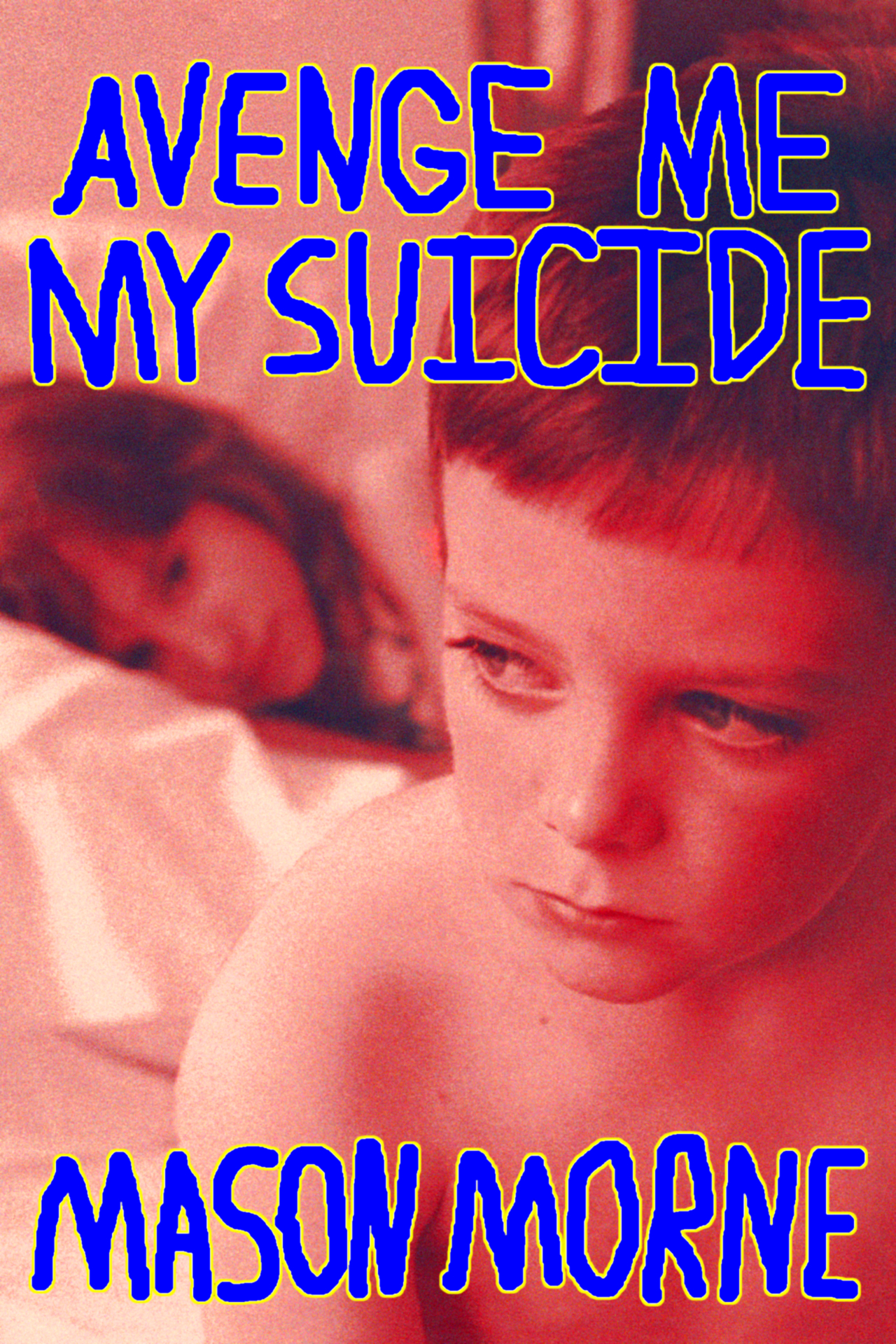
First up, this crowd may be over-sensitive to this kind of thing (thanks to the discussion surrounding previous covers), but the first impression I get is one of the morning after an eight-year-old one-night stand. I don’t know if child-sex figures in your book, but whether it does or whether it doesn’t, featuring an image indicative of it on the cover will probably drive away a lot more readers than it attracts (and those it attracts will probably be attracted for the wrong reason, because ew).
I don’t mind the childish hand-drawn type because it’s actual hand-drawn type, not a pre-made font that tries to imitate hand-drawn type. However, I would definitely blur or otherwise soften the edges so that it looks less like it was drawn digitally.
Not technically a “cover” comment, but I question whether an eight-year-old would use the arcane grammar of the title (unless the eight-year-old in question were a pre-pubescent H.P. Lovecraft).
Of my three comments, I think the first one is by far the most important. Unless there’s another shot from that same photoshoot in which the boy is at least wearing a shirt, I would advise you to scrap it and find an unrelated image which doesn’t have that same “ick” factor.
Other comments?
Well… skipping that, I will instead talk about the type.
I don’t like it. The idea of it I like, but the letters that are there I do not like. While it does look childlike, these letters are very obviously drawn with a mouse and not by hand. It gives this the look of being a style of font you could see on a book about an 8 year old, who lives in space and has madcap alien adventures. (The screen saver blue and 100% Y outline isn’t helping set the tone either.)
The idea of the font is sound though. Actual hand written letters would be better, or as Nathan said – softer. It would make this feel more like the story you described. It would be especially effective if a child actually wrote it. Block letters, by a child, for a story like this. It could be so powerful.
Maybe use an anagram for suicide though if you do get an 8 year old to write this…
I am going to pass by the appropriate/inappropriate image topic, as the last time I made a comment remotely touching on that, it got up somebody’s nose. You’d have to be exceedingly naive to look at this image and not see the possibility of issues.
I simply don’t like the cover very much. I don’t give two hoots about the issues or non-issues. The imagery is weak albeit suggestive, and the handwriting script is not attractive. The image is too washed out. It does not have enough contrast. The pinkish wash across it doesn’t help. The text isn’t sufficient to create the contrast. You can see how weak the contrast is when you look at the thumbnail. (I assume that the yellow edge around the blue lettering is to solve an aliasing problem.)
So, I’d start over. I’m going to assume that RK’s points, below, are accurate. Assuming that the author is unwilling to nuke the storyline, then fix the cover. I think that there’re a lot of ways that this could go, that would be more marketable.
I don’t feel that this cover can be tweaked in a way that would make it successful. So, it needs replacement.
Doubt any of that helps. It’s simply more of the same. I do think that the handwriting-style lettering or font is probably a lost cause.
Of course, since the story’s already been done, so has the cover for it; in fact, several covers and a movie poster. I even found a picture of the cover for the original Burt. It wasn’t a bad picture at all as they go, but the title really is an important part of the marketing. Avenge Me My Suicide and When I Was Five Years Old, I Killed Myself certainly gets more potential buyers’ attention than just Burt (as Howard Buten learned).
Still, if I were titling the novel, I probably would have gone with Why’s Everyone Dumping On Me? It Was Her Idea!
One way to rescue the font would be to go over it with a texture that makes it look like it was written in crayon.
Agree that the photo should probably go – the pink tint isn’t helping. If you airbrushed out the girl in the background, you might be able to save it.
Is that writing literally drawn in MS Paint? That’s not an insult, that’s an actual question. It’s aliased and it uses fully saturated colors and a uniform-width default shape brush. It just looks amateur.
I differ from Nathan in that I’d a million times prefer a nice handwriting font to hand-drawn bad handwriting. (Not that kid handwriting doesn’t look the same as sloppy adult handwriting.) If you must letter it yourself, do it with a tablet in Photoshop, or better yet, GIMP with line smoothing on.
As for the picture, aside from the ick factor, there’s a massive amount of high-iso noise. Find a photo with less noise or do a selective blur to smooth it out.
All I can really do is second what the others have been pointing out.
The photo is disturbingly suggestive in a way I suspect you didn’t intend.
The idea of having the title written in such a way as to suggest it was done by a child is good….but the execution is clunky and the colors are simply cartoony—and both are in jarring contrast with the subtlety of the photo.
Here is one thought you may want to play with: have the entire cover appear as though it had been created by an 8-year-old, with the art being the kind of drawing one might find in therapy.
I also agree that “Avenge Me My Suicide” is phraseology that hardly sounds like that of an 8-year-old…even a precocious one.
I like Ron’s idea about a therapy drawing for the cover – although I’d add it might be best to have it as looking like a photograph of the drawing rather than just the drawing itself as a cover, perhaps on a table or inside an open file or something (to avoid it earning the ‘Art for a Refrigerator’ title instead 😉 )
I’ve got to admit, this cover’s designer earns some admiration from me for this image’s being one of the best cut-and-paste jobs I’ve ever seen on here. I must also admire him for being very good at covering his tracks: neither Google Images nor Tineye were able to turn up any source image for this cover on a reverse-image-search until I cropped out the title and byline. Bottom line: the designer is both a very sneaky and very audacious plagiarist.
Here‘s the album cover for the Afghan Whigs’ album Gentlemen. Look familiar? When this album was first released, their label-mate Linda Ronstadt drew very much the same conclusions about its cover as all of you have about this one. The band’s only response to her accusations was a tu quoque ad hominem attack on her. Curiously, no one else seems to have noticed what its blatantly suggestive imagery was suggesting, or if anyone did, no one cared to take any flack from the group for speaking up about it the way she did.
I strongly suspect it’s not just the cover that’s plagiarized either. Had I not had a longtime hobby of watching and collecting obscure indie flicks and foreign films, I might never have heard of the book and movie which it’s highly probable are the source material for the story summarized in the synopsis. Quand J’avais Cinq Ans Je M’ai Tué (translation: When I Was Five, I Killed Myself) is a French movie based on Howard Buten’s best-selling novel of the same title about–stop me if you’ve heard this one before–an eight (almost nine) year old named Burt (Gilbert in the movie) who’s an inmate at the Pâquerettes Children’s Home for what he did to his classmate Jessica. While he’s there, a compassionate doctor develops a friendly trusting relationship with the boy which a higher-ranking authoritarian doctor tries to thwart.
Unlike a certain very hostile critique (entry #4, if curiosity compels you), I won’t spoil the big revelation at the end of the story. Let’s just say that the boy’s title drop at the beginning mentions committing suicide when he was five, and yet he’s eight years old now and quite alive mentally and physically; obviously, he didn’t mean that literally. Also, the movie is intended for mature audiences, and yet has very little on-screen violence in it. You get no points for rightly guessing what the big plot twist is.
I strongly doubt the Afghan Whigs’ and Howard Buten estate’s lawyers will be very forgiving of the author/cover designer if they should see anything like this on sale at Amazon or Barnes & Noble. Obscure as these works may seem to us, every article I’ve seen on the Afghan Whigs’ Gentleman insists that it’s a famous masterpiece that marked a major turning point in the development of the alternative music scene. As for Quand J’avais Cinq Ans Je M’ai Tué, a book review informs me that while the original American novel (originally just titled Burt) was a total flop here in America, something like a tenth of the entire population of France has read its French translation and it’s very popular across the pond.
In short, on the slender possibility that this work is actually a serious going concern, I recommend scrapping not only the cover, but the book itself. The cutting-and-pasting, mouse-drawn block lettering (technically “hand-drawn” if you count the hand on the mouse, I suppose), hue adjustment, and fine-grain dithering are enough to fool the reverse-image-search engines and critics who aren’t into alternative music or French culture, but lawsuit-happy lawyers (not to mention Afghan Whigs and/or Howard Buten fans) will surely discover the copyright infringement sooner or later if this book ever gets published. Even in the morally bankrupt studios of Hollywood, getting a story “inspired by” a much more original work released on the big screen involves more than just filing off the serial numbers, getting a new paint job, and changing the license plates before parading it up in front of its original author(s).
Since my post providing copious evidence in multiple links has not been approved, I will summarize and let others seek out the evidence, which should speak for itself quite plainly. This cover is stolen from the musical album Gentlemen by the Afghan Whigs. I also strongly suspect that the story is stolen from Quand J’avais Cinq Ans Je M’ai Tué, by Howard Buten.
Sorry, multi-linked posts get stuck in moderation and sometimes I don’t notice that they’re there. I shall correct.
Ah, thank you. I was beginning to be concerned that you might be angry with me.
This picture is indeed stolen, so that is a great catch RK.
We may have to file this under the designer simply not knowing that Google Image search images are not free to use. It really does happen all the time, and this may just be another case of this. Hopefully it was not done intentionally, and thankfully it can be fixed now before this could cause problems.
As for ideas, unfortunately that area is much more muddled. You can’t copyright ideas. I could right now write a story about a wizard school in England, and JK could not stop me. However, if more and more plot points line up, or Harryesk ideas slip in, then there could be trouble.
If this story simply used the base idea of the Quand J’avais Cinq Ans Je M’ai Tué, and is completely original beyond that, then there really is nothing that Howard Buten could do. If vast sections of plot line up, or if characters are really similar, then there could be a problem.
It is a strange creative world out there. Only Mason can fill us in on the intent now.