The author says:
This is a picture book intended for adults to read to young kids, or for older kids to read to themselves. The aim is to present the science behind how an Aurora occurs but without losing the sense of wonder and awe that science can sometimes kill off. This is done by simplifying the scientific explanations, adding some drama, and the use of rhyming language. This book is the first in a series titled ‘Tales of Science and Magic’.
Nathan says:
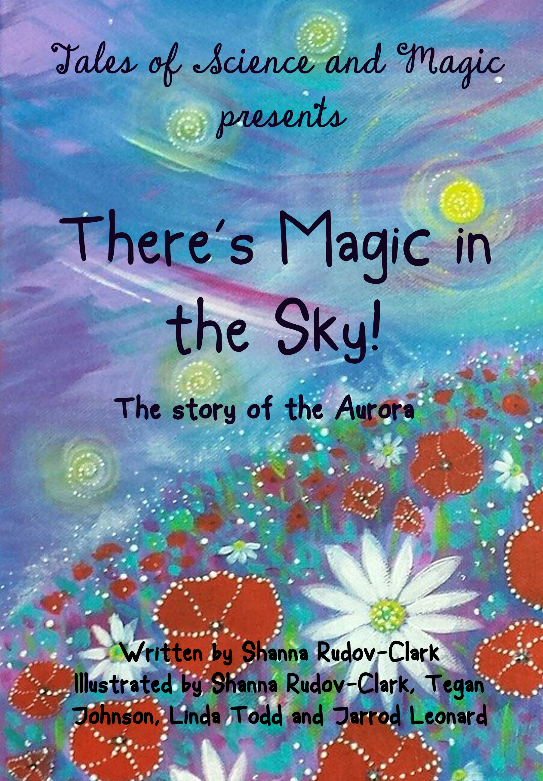
A commendable project, and I have no complaints about the art (which is good, since that is the one thing that can’t be changed here). So let’s look at the type.
I was going to point out the mismatch between the whimsical flavor of the supertitle and the simplicity of the rest of the type, but I think we actually need to go back further. The cover art is obviously hand-done, and while the type tries to match that, it’s just as obviously a computer imitation of hand-drawn lettering. I think you would end up with a far superior project if you asked one of your contributing artists to hand-letter the cover!
There’s a particular problem with your credits block. I would (a) separate the “Written by” info a little from the multi-line “Illustrated by” part. I would also make sure that none of your illustrators’ names are split by a line break.
Other comments?
Yeah, I don’t like the art. Sorry.
First, I’m going to be a total dick and say that on a technical level it’s just kind of crude: The edges aren’t crisp, there’s show-through, the texture of the substrate is too obvious, and the stems and leaves are just blotches. Science picture books need to have clear, detailed illustrations so you can easily tell what’s going on.
Second, I would never in a million years guess that this was a science picture book from the cover. I actually thought it was a poetry anthology until I read the description. The picture looks like a generically pretty background image; there’s not much value variation, it’s too abstract (I can’t tell that there’s an aurora in this picture), and the closest it has to a focal point is not the sky but the flowers. The art should be the most important element on the cover of a picture book, and it should tell us clearly what the book is about.
As to the typography, the title-case is just too cutesy for a science picture book. (Again, it make me think “poetry anthology.) Science picture books usually have big, bold typography.
(Also, science kills off wonder and awe? Pff, everyone knows it’s the other way around.)
Hmmm… This is another cover I initially took to be intended for a compilation of highbrow art or poetry. I’m seeing flowers and a sky at dusk, but where’s the aurora? As I recall from living in Minnesota as a kid, the aurora I saw there looked like a big glowing curtain spread across the sky, complete with curves and wrinkles at the bottom (a lot like this, except green). This artwork looks more like something out of Van Gogh’s Starry Night; pretty, to be sure, but not really relevant to the subject at hand. Why not just use a picture, or a painting, of an actual aurora? Heaven knows, there are plenty of them available relatively cheaply on the internet, and a lot of them in ridiculously high quality too.
As to the font… well, as Nathan says, no machine simulation of hand lettering can match an actual human’s hand lettering. I recommend hiring a calligrapher to do the lettering. While you’re at it, bear in mind that plain black and plain white are too drab for the cover of any book for kids. If you can afford it, try having your calligrapher use metallic ink; preferably something glittery that looks silvery or golden.
Science’s effect on “wonder and awe” (or as I prefer to call it, aesthetic appreciation) tends to depend on one’s approach to the given subject. With aurora borealis, you’ve got a natural phenomenon that already comes brightly colored (no need for any Technicolor Science) add-ons) and is a visual manifestation of the otherwise invisible forces of electromagnetism. I wouldn’t worry too much about the scientific explanation dampening any kid’s enjoyment of an aurora, therefore; as long as you use layman’s terms and show lots of pretty pictures, the kids should be all right.
Again, though, we need to see a pretty picture of an actual aurora right there on the cover. The present illustration is too vague and won’t draw very many of the right kinds of eyes (specifically, those of your target audience) to it.
Where to start…
The art seems entirely inappropriate for a book subtitled, “Tales of Science and Magic.” Nor does it at all seem to convey anything of the actual subject, “the science behind how an Aurora occurs.” With the focus on the flowery foreground anyone might think the book is about flowers.
I would suggest replacing the art entirely. I might even suggest finding an actual photo of an aurora. NOAA has some beautiful high-resolution images that are free to use:
https://search.usa.gov/search/images?utf8=%E2%9C%93&affiliate=photolib.noaa.gov&query=aurora&commit=Search
Since most of the other problems have to do with the typography, it would probably be best if I withhold those until the art is replaced since different art will demand different handling of the type.
But…if you are adamant about keeping the existing art you need to have much more contrast between the art and the type: Not only is the narrow black typeface difficult to read, its color is deadly dull.
Also, in your list of names be careful where you split lines, as Nathan says. It would be better to have Tegan Johnson’s name in one line rather than two, thus—
Illustrated by Shanna Rudov-Clark,
Tegan Johnson, Linda Todd
and Jerrod Leonard
Assuming you decide to stick with this art, the things that immediately jump out at me are that the bylines are unreadable against that busy background. The subtitle has the same problem, though not nearly to the same degree. It isn’t just the contrast; there’s simply too much visual distraction to put text on top of all those flowers.
I would suggest putting the contributor names against a solid background at the bottom. You might also consider either including only the author’s name on the cover or shortening the bylines to say “Rudov-Clark, Johnson, Todd, and Leonard” so it will be readable at a distance. You can always put the full explanation of what each contributor did on the title page where it won’t be competing for the reader’s attention.
Finally, the lowercase “a” in “Aurora” is just about unreadable. There’s just not enough of a space inside the letters to be visible, particularly against the darker background. I would really suggest changing the font, as handwriting fonts aren’t really my cup of tea, but if you decide to stick with that one, I would suggest hand-editing that letter to open up the gaps so that it looks like an “a” instead of a black blob. 🙂
Hitch waves: “Hi, Dag!” and returns this thread to its proper owners.;-)
guys, thanks so much for your feedback!I have opted for a clearer pic of an Aurora for the cover. just FYI this book is a rhyming book. yes it does cover the basc science of an Aurora but it is not meant to be too serious 🙂