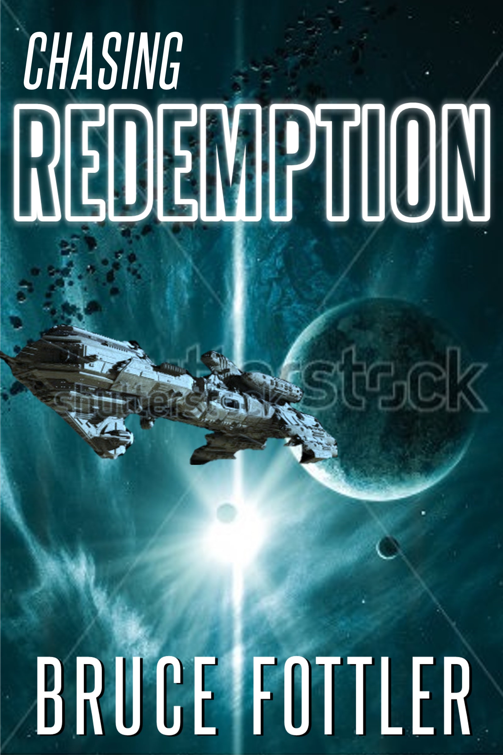
The author says:
Take two of my cover upgrade for “Chasing Redemption.” I found a background image that gives a clear impression of SPACE, and even added in a space vessel. The photo resolutions are low (using sample images) and the lighting/shadows are not really correct on the vessel, but it gives you an overall feel for my idea. I’m also very tempted to nix the vessel and just go with the background image. I fear it’s going to be too difficult to add something to this background without it looking too cut-and-paste.
[original submission and comments here]
Nathan says:
Much, much better. I can instantly tell the genre and setting from the thumbnail.
I would vote not to lose the spaceship (or not to lose the idea of a spaceship — you may find one with lighting that meshes better, though I doubt it; you’ll probably have to go in and paint a reflective glimmer along the far bottom edge of the ship).
My only suggestion, and I leave this open to commenters to support or nix this, is to add a hint of contrasting color somewhere on the color. May a red-orange in “Chasing,” or in the shadows on the byline; maybe some subtle maroon veins in the shadow-side of the planet.
Other comments?
Have to agree that this is a lot better. I know this is sci-fi.
Love the background and the spaceship. Don’t ditch the spaceship, unless you’re going to give us something else to look at.
As for contrasting elements, not really sure that it’s necessary. I like this cover as is. Still, there wouldn’t be any harm if dabbling with it on your desktop. I downloaded it and tried red-orange on “Chasing”, and I found that it clashed (at least with my amateur skills). Yellow worked best for me. But again, I like this cover as is.
This reminds me more than a little of that Spacelore cover we had on here a few weeks back… Well, as I see it, I can either explain to you what finishing touches remain to be done on this cover in so many words, or I can show you. I prefer to show you.
Superb! Hard to see how this could be improved upon.
Yeah, what RK did is nice.
Again, your spaceship is muddy looking. Your whites are too dark and it makes the entire thing dull and look like it is made of blue stone.
It shouldn’t blend into the background so well, it is just too blue.
I know what you are trying to do making it match the image because that is the colour of the light source, but in doing so you are making this harder on yourself. It needs to match exactly this way.
Oranges stand out on teal, use that colour for the ship.
I like what RK did. Make the ship the contrasting element for the picture, and the text. Honestly, I am sold on that one.
Aw man, I really want to like it…
…But I can’t get past the fact that the lighting in the two images is the exact opposite. It’s just got to match or else I can’t think of anything except how the lighting is wrong.
Might be easier to keep the spaceship and find a front-lit picture of a planet.
If you can fix the lighting (which is a little jarring…though, in truth, it’s not really correct in the original background art anyway), this would be a first-rate cover. I agree that it’s a little monochromatic, which in itself is not bad, but a little contrasting color would punch up the artwork which at the moment looks like a black and white image that has had a single color added to it, like a duotone.
Thanks to all for your input. It’s good to hear that I’m in the right neighborhood with this version.
RK – Thanks for taking the time to create an alternative. I like your color refinements. However, I managed to find another spacecraft that fits much better with lighting & shadows. It also more closely matches the description of the vessel in my book.
As always, CoverCritics was a big help!