The author says:
Contemporary romantic suspense set in Africa. Will appeal to readers of JA Huss and Alessandra Torre. Falling for my hot billionaire boss and his hunky Black lover should have been enough trouble, but the bad guys struck again. They took Kane and his fate was up to me. Unless I returned to my captors, our threesome might remain incomplete — permanently. The deeper I went into the mystery of West’s business in Africa, the more I feared the truth. Did he really care about me, or was he using me in his dangerous game? Did the two of them want me as much as I hoped, or would they send me home if I made another mistake? And could I remain untouched through a second abduction? This is the third and final episode of the Billionaire First Boss Menage Suspense serial.
Nathan says:
So even though this is the third of a series, I’m not going to take into account any branding continuity from the two preceding volumes. If we come up with good design ideas here, you can reserve-engineer it for the earlier books in the series.
The thing with billionaire romance novels (and now we’re already deep into a sentence that I never thought I’d type) is that there are so many of them. I can’t look at a “free books” or “books on special” bulletin without seeing at least one. That means that, in a glut, your cover needs to stand out, or at least hold its own. Here’s how I see them doing it:
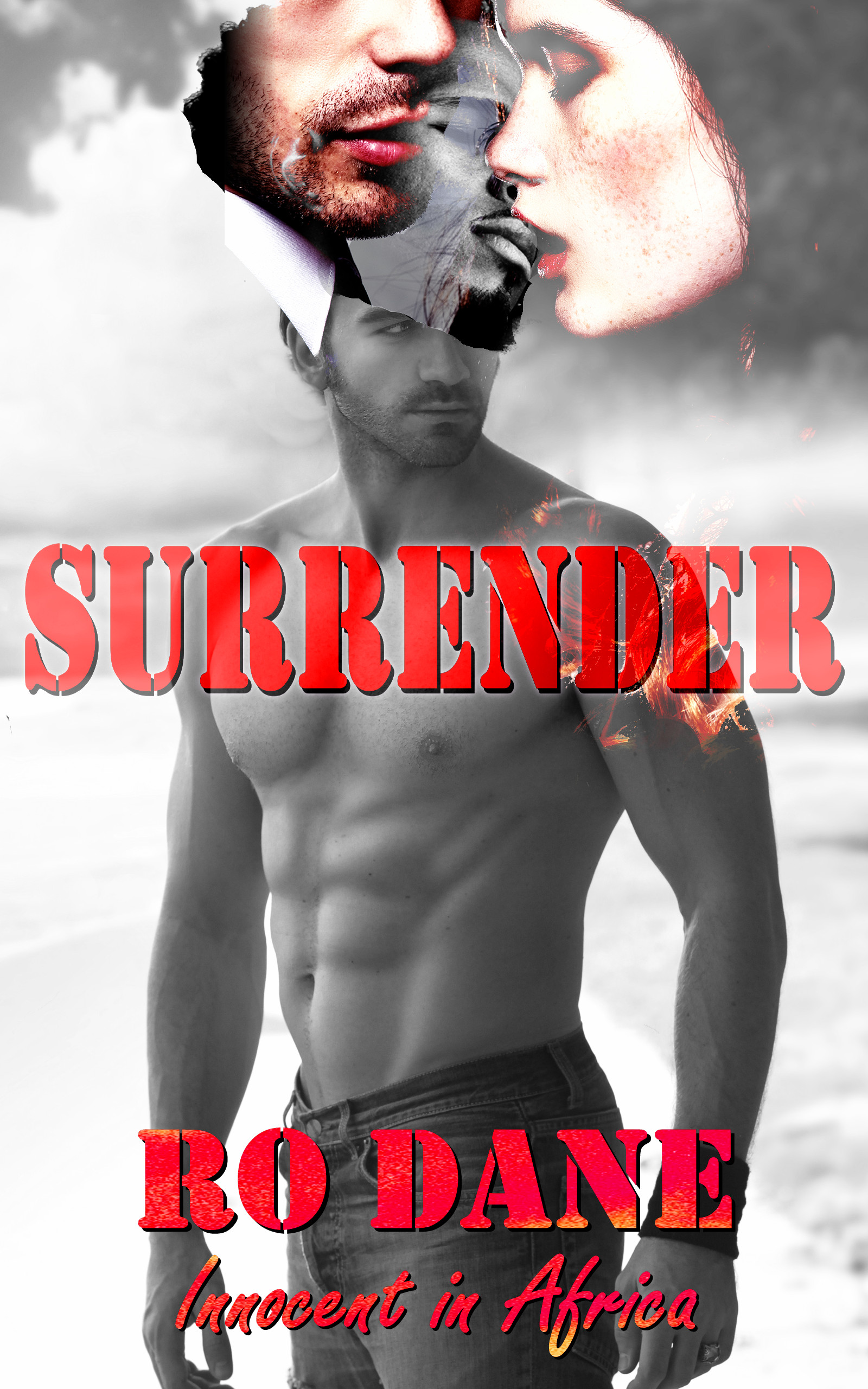
- Color. Not just a color, but vibrant technicolor — deep, rich hues. I don’t think that the monochrome photo with red type you have here competes. The only place on your cover where color comes to the forefront is where you have, confusingly, three faces overlapping for no discernible reason. Confusion isn’t hawt.
- Romance. Just about all of them have some incontrovertibly romantic imagery, and some of them eschew any subtlety altogether. Compare that to yours; yes, there’s a shirtless hawt guy, but he’s just standing outside. There are no dramatic shadows, no deep skin tones (except, again, in the confusing overlap of faces).
- Fonts. I suppose that stencil fonts might work in a military-themed romance (if supported by the other elements above), nothing about your description suggests that stencil fonts might be appropriate to this story. And the handdrawn font below it absolutely needs to go. (While we’re at it, dividing the title and subtitle with the byline is a really bad idea.)
- Sub-genres. We’ve all seen them: romance novels which don’t just divide themselves into Regency or contemporary or paranormal or romantic suspense, but super-granulated sub-sub-genres: “Taken by the Alpha Billionaire Shifter, A BBW Polyamory Pregnancy Mindswap Romance.” I think the reason behind this (well, the most defensible reason) is that, in picturing sex, readers are very definite in who they want to imagine humping who. Your description mentions a black lover, and the whole thing’s set in Africa; do you think you should maybe include a black person somewhere?
Sorry if this seems overly negative, but as I said, the subgenre you’ve chosen is one in which readers have no shortage of reading options. Is your cover going to grab the attention of the appropriate reader, versus the five or six other covers that reader will see at the same time at the bottom of the Amazon page?
Other thoughts?
I am sorry, but this very much looks like a shirtless white guy, wearing a hat made from a black guy’s face, that two ghosts have taken a fancy to and started to eat.
If you want both elements on this cover I think you are going to have to divide them up. I don’t think you should keep both elements though – I think you shouldn’t keep either if I am to be honest. The cut together look of the three people isn’t working here.
I think it is time to look at some stock image sites. Try to find an actual image of three sexy appropriate people and make sure there is more than one variation with them for the other covers. (You can get a temp design file for free to use for now)
Good luck!
On the downside, this cover looks like any of about a thousand erotica novel covers I’ve seen on Smashwords that usually end up getting submitted to lousybookcovers.com for our amusement; and the apparent bisexual polyandry in your synopsis is definitely not one of my preferred genres, let alone sub-genres. On the upside, from what I’ve seen of the covers on bestselling erotica books that don’t end up on lousybookcovers.com, making a cover for any kind of niche erotica (e.g. Nathan’s Taken by the Alpha Billionaire Shifter, A BBW Polyamory Pregnancy Mindswap Romance) is not all that difficult. You just have to show an apparently seamless photograph of the participants and/or some visual reference to whichever target audience’s fetish you’re indulging; in a lot of cases, these don’t even necessarily include a real background.
In your case, what you need to show is very simple indeed: one black beefcake, one businessman in a very expensive-looking suit (that billionaire guy), and the scantily clad woman protagonist standing dead center between them. (No matter what feminists may say, women are still deemed the fairer sex in any erotica in which they participate, and should therefore always get the lion’s share of the attention on the cover.) Anything else you might think to add is strictly optional, and you should probably opt not to add it unless it’s absolutely crucial to the story for some reason.
Assuming you can’t afford to get three such people together to model for a photograph for your book’s cover, you’ll probably have to splice together a couple of stock photos. This is fine, as long as you can keep them from looking spliced together. That is to say, make sure everyone appears to be lit from the same angle, use advanced blending tools on your picture editor(s) to conceal the cutting and pasting, and either have all characters cast appropriate shadows or show them from some angle or in some situation in shadows are unnecessary (e.g. against a blank background).
Once you have this and an appropriate font (study the fonts your aforementioned authorial models JA Huss and Alessandra Torre are using for inspiration), this should sell at least as well as any other story of its type.
As Nathan and the others have already really covered the ground for this, my sole observation is: my clients tell me that there are several stock photo sites that have numerous images that would work for this. You can go as steamy or non-steamy as you want (and as Amazon & SW allow). There are sites with everything from single models to downright orgies, so you really ought to be able to find one white guy, one black guy and a chick.
Hope that helps you.
There is really not much that can be done with this cover other than to start over from scratch. There are so many problems on so many different levels that it would be much simpler to do an entirely new cover.
I sort of like the idea of the page ripping and another image emerging – and that is unfortunately the only thing I like. The three heads emerging from the one guy’s head seems more horror than romance or even thriller, but it does not fit at all with the rest of the male-model-on-the-beach image, and is not even competently done. It also seems the story is told by the woman, so why is the cover dominated by a lone man? It should either be the woman in the centre, or the two men she has the hots for. And yes, the font is wrong.
So, I would think starting over is the best if not the only option. And as suggested, I would go with a stock photo with three people already in it – splicing rarely works, or you have to be really really pro with Photoshop, if the idea is to made them look like they were photographed together.
Thanks everyone. Glad I tried this. It was helpful.
BTW, I actually did look for a stock photo of three people first.
The verdict: I’ll get a designer for this one. And no more adding people on covers I make myself.
Nathan, thanks for the specific pointers: “dividing the title and subtitle with the byline is a really bad idea.” This, and other points you made make sense and hadn’t occurred to me. I see your point about standing out from the glut. BTW, the guy in the middle at the top is black, but that pic, as with many elements, didn’t work.
Thank you for your time.