The author says:
The first in a series of stories featuring covert operative Alexandra “Alex” Granger and her off and on lover/partner Marcus Kane. In THE ASSASSIN’S BRINK, former Delta Force operator Alex Granger is recruited by the Central Intelligence Agency for an off-books mission in Iraq to assassinate ISIS commander Abdul bin al Kamal–formerly known as Lt. Cdr. Kenneth Monroe, a Naval Intelligence officer. But nothing is what it seems when Alex finds herself ambushed and nearly killed by a CIA strike team. Wounded and on the run from her own country, Alex calls upon the one person she can actually trust: Marine sniper Gunnery Sergeant Marcus Kane. Now the duo face off against a shadowy cabal working within the CIA who want nothing more than to end their lives and keep their existence a secret.
Nathan says:
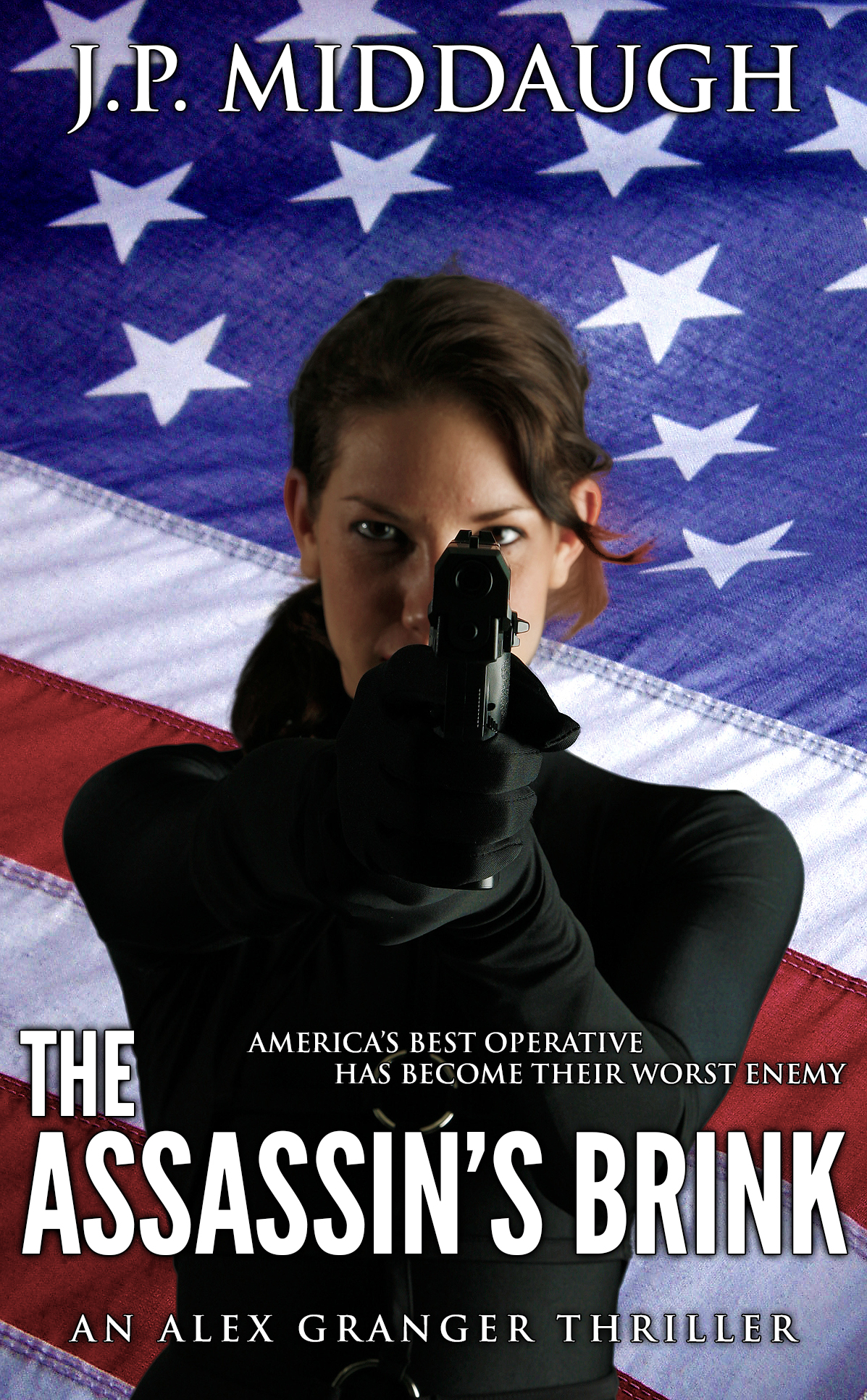
Very professionally done. My main complaint is that it’s aggressively generic: Flag, assassin, even the fonts chosen, all look calculated to be an indistinguishable thriller.
If Iraq is a major setting in the book, I’d try tinting the image with a sandy color/texture, both to indicate more of the story contents and to give the illustration some distinguishing factor.
Also, if the assassin photo extends down further, I’d try bumping her up on the cover to give more room for making the title larger without obscuring her hands. And, as I said, finding variations of the fonts that aren’t as generic.
(One other point: “America” is singular, so “America’s Best Operative Has Become Their Worst Enemy” doesn’t make sense unless “Their” refers to something else entirely, which is confusing.)
Other ideas?
One of the biggest problems I have with the cover is the lack of contrast in the figure: it is very difficult (read “nearly impossible”) to separate her right arm, hands and gun from the rest of the figure. The right side of her face could stand a little more contrast as well, bringing out the fill light on the side of her face.
As it is, most of the figure is a featureless black shape…which is exacerbated when seen in thumbnail size.
If the setting of the novel, or at least its main theme, is the Middle East, I would certainly consider either replacing the flag with something more appropriate to the story or combining the two in some way.
Finally, the cover looks a little unbalanced. Shifting the figure higher in the frame would help this.
By the way, Nathan is absolutely right about the grammar in the tag line…unless, as he suggests, “their” refers to another entity. But since it is confusing you may want to reword this.
I agree with the black void-shadow being a tad confusing – looking at it quickly, her ponytail and arm seem to blend into one. It might not be the best ever stock photo of a woman pointing a gun, the way her face is obscured is also making her look a little cross-eyed. (It’s not a terrible picture, I’d say keep it if you have already paid and/or you really like it.)
And I do also agree in that she could be moved up. There is sort of a gap between author’s name and her head: you could bring that down, so it would be in the middle between her head and the upper edge, or bring the picture up.
This, if you do want to keep the design, as it is very generic even if it is otherwise pretty good.
On the upside, for the first time in quite a while on here, my first impression of this cover pretty effectively matched the description. On the downside, as Nathan says, it’s so generic. Its greatest strength is also its greatest weakness: it’s obviously a Clancy-style espionage thriller–of which there are only a few zillion on the market already. To state the problem subtly, I doubt Tom Clancy loses any sleep worrying about his competition.
Having recently gotten a bigger and better monitor for my PC, I’m seeing the reflective shine your protagonist’s black catsuit better than I would have on the previous monitor, but she is still too dark, especially in the thumbnail. Rather than increasing the contrast, which only serves to dim her out further in my graphics editing program, I recommend applying some gamma correction and bumping up the color saturation, as I’ve done with my 15-second revision of your cover. (True black, of course, is almost non-existent in clothing: as this revision demonstrates, the model’s suit is actually a very dark cyan.)
Yes, a different background might help; I’m just not sure what to recommend to you. Part of the problem with getting you a gimmick to help your cover stand out is that the plot itself as given in your synopsis is rather generic. Having to fight your own country’s forces because your enemies have infiltrated the leadership or someone in command has gone insane is a tried-and-true storyline from several hundred Hollywood movies going all the way back to Dr. Strangelove and beyond. Even if you can think of something more offbeat to grab your readers’ attention, the tagline is going to have to help carry the rest of the load.
Speaking of the tagline, you wouldn’t be the first to be confused about the grammatical rules concerning pronouns referencing a group; in fact, a lot of your readers might even let you get away with using “they” or “their” to refer to an indistinct entity such as the shadowy cabal you indicate has infiltrated the CIA in this story. The real problem is not that you’ve left your reference (who or what “they” are) ambiguous so much as that your tagline, like the rest of the cover, is so generic. Like the synopsis itself, it will likely leave your prospective readers sarcastically muttering “Gee, never heard that one before.”
In short, everything is generically good, but needs more distinction. In addition to a new background, if you’re pitting a “power couple” against the entire CIA, your readers would probably like to see your protagonist’s partner somewhere on the cover as well. A splashier font may help, but won’t carry the cover by itself. The tagline needs to be something funny, or ponderous, or mysterious, or anything but the generic description you’ve got right now. You’ve got a good cover; now try to make it a great cover.