The author says:
Set in a fictional world inside a computer simulation, the book follows a high school freshman who seems to attract trouble wherever he goes. There are weapons in the book which are disguised as walkmans, so those are important. The events take place in 2002 (in the simulation) even though the simulation is running several centuries in the future. The book is a fusion of new adult, fantasy, science fiction and thriller. The target audience is minimally late teens (18 and 19), even though the main character is 14.
Nathan says:
There are a lot of good ideas here. I’m not so sure that they work well together.
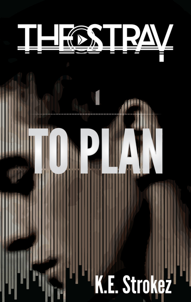
First: Which do you want to be more prominent, the series title or the book title? Given that the heavy branding is apparent in the series title, I’d go with that, and make the book title subordinate to that, both in size and in position (by which I mean, I’d place the book title more directly beneath the series title so that one can clearly dominate the other).
I’m also not sold on the title/byline font. It obviously isn’t the same one as in the series title, but it’s also a sans-serif font (and the title is also in all caps), which means it doesn’t contrast cleanly either. I’d play around with some slabbish serif fonts to see what works better. And the placement of the byline is counter-intuitive; yes, I understand you didn’t just want to center-justify everything, but the off-center placement of the byline just looks like you moved it to the side because, well, you didn’t want to center-justify everything.
My biggest complaint, though, is that there isn’t enough “zing.” The muted color scale, the abbreviated dynamic range… nothing grabs me. Could there be more contrast in the model’s face? A deeper-hued tint tying it altogether?
I’ll let the others come up with further suggestions.
I generally like the art, though having the bridge of the character’s nose tangent to the edge of the cover looks pretty odd.
The center of the cover is occupied by the boy’s cheek…i.e., an uninteresting, flat, dull brown space.
One test of a cover is to imagine it with the title in an unfamiliar language. Would you still be able to tell what the book is about or what sort of book it is? I think in this case, the answer would be “no.” In fact, I don’t think a potential reader would know what sort of book this is even with title still in English. In short, it simply doesn’t read ” new adult, fantasy, science fiction and thriller.”
I have no idea what the “The Stray” logo refers to. If it is the overall title of a series, this is not at all clear. It is also a little over-designed, making both hard to read and the dominant element on the cover.
I’m also not sure what the little grey bar above the title is supposed to be. The number “1”, indicating this is volume 1? If so, I would be more explicit about that.
I would work on the placement of the author’s name. It looks like an afterthought tucked into the bottom corner that way. With all of the other type centered, I would not only find a better place for the name, I would also make sure it is centered, too.
It took me so long to figure out that “The Stray” was the series name, “To Plan” was the book name, and that little gray mark was a 1.
Overall, while this cover seems to be proficiently created, it’s not doing much for me. Too dull. No zip, no pep. I think it violates my cardinal rule, which is that covers have to be bright, shiny, pretty objects that make humans (and crows!) want to pick them UP. After all, your cover is nothing more than a tool to sell books. The success of your cover is directly NOT related to your story. Many novels, like GOT and THG, have covers that are nothing more than a background color with an eye-catching symbol.
I literally did not see the “1.” Not until Ron Miller mentioned it. My eyes slid over it without registering its existence. That can’t be good. I’d look to see if there was someplace in the series’ logo that it would fit into, like…perhaps to the lower-right-hand-side of the “Y” in stray? And I’d definitely change the color, make that pop. Maybe even a red. If you don’t change the existing tone, that brownish feeling to it, perhaps something more orange would be better.
Should I infer that the doodah between “the” and “stray” is a Walkman play symbol? I was an adult when Walkman came out; we had them ourselves, and I didn’t recognize it. Comment provided solely for what it’s worth.
You may wish to think about one option–flip the image so that the guy’s face is angled toward the inside of the cover (psychologically, he’s looking into the opening of the book, like using people with eyes looking at your menu list, on a website), and–not sure if this will work–you could then stagger your author name down the front, aligned up to his jawline. So that K. or K.E. would be at the top of the jaw, then Strokez below it and further to the right. It might look dreadful, but it might work. You’ll need a lighter font for that. I’d like to see something with a wee bit more zing to it.
I’d marry the styles for the title and the series’ title. Conform them. Right now, they look the way two different shades of blue do, when you try to match two navy shades, and get it slightly wrong. And consider a serif for the author name. I wouldn’t like to see three fonts on the cover. Experiment with it. There are a large number of “sci-fi” fonts on Derek Murphy’s site that you can reference: http://www.creativindie.com/300-fool-proof-fonts-to-use-for-your-book-cover-design-an-epic-list-of-best-fonts-per-genre/ , along with some other fonts/genres for your consideration.
Good luck. Sounds like a fun book.
To a degree, I can see what you’re trying to do here. The synopsis sounds a lot like the basic plot of The Matrix with a little bit of WarGames-style paranoia thrown in. The uneven vertical bars are reminiscent of audio meters on computer multimedia players (presumably something to do with those weapons disguised as Walkman players you mentioned), and the posterized image is reminiscent of the old 256-color VGA graphics from the early days of computing and video gaming. Together, these do give the cover an old school computer-ish feel.
The main problem is that both the expression on the character’s face and colors used to draw it are very drab and muted, suggesting that his life is very drab and muted too. Even if his life is very repressed and dull before it starts getting more exciting than he really wanted it to be, you don’t want potential readers to start thinking your story might be boring and plodding too by association. If anything, the nostalgia retro artwork is intended to inspire in its audience ought to stir some excitement: “Hey, remember how when you got that brand new computer with all the bells and whistles on it 13 years ago, you thought you could die happy because one gigahertz of processing power was all you were ever going to need?” Heck, WarGames came out in 1983, and it’s still a thrilling spectacle for the eyes even when all the 3-decades-old technology in it looks so clunky compared to what we have now.
So yes, more vibrant colors and a shot of your protagonist being more active would be a big help. That’s even if he’s just sliding a mouse around; Matthew Broderick managed to make his character look pretty exciting on the poster for WarGames just sitting at a computer working a keyboard. Also, while vertical bars fit the theme of weapons disguised as audio players, do bear in mind that on older computer monitors and televisions, the pixel scan-lines were horizontal. One good way to split the difference would be to divide the picture both ways and show us pixels with lines between them the way one can see on any monitor from any era with sufficient magnification.
Your fonts, likewise, should have a computer-ish motif to them. Obviously, 2002 not being 1983, you need not use the old dot-matrix fonts of the WarGames era, but something in vogue for computers back around the turn of the millennium would certainly be appropriate. For the “1” in your title, I agree with the other critics’ assessment: be sure to get something with serifs so that potential readers will notice that this is actually a number, and not just a random fleck on the cover. If you don’t want everything center-justified, you might still want to balance your cover by edging your series title over to the left to offset the byline’s justification to the right; a diagonal layout will also add a little energy to the cover.
In short, you’ve got your cover’s theme right, but it needs some more excitement and pizazz. The computers of 2002 weren’t the old green-screen monochrome monstrosities of the kind The Matrix‘s green-and-white color schemes typically referenced, but they also weren’t the high-resolution 32-bit color devices we have now. (Heck, I can remember when a 320X240 resolution seemed to be all the resolution digital videos would ever need.) If you can go for a middling pixelated 256-color scheme something like one sees in animated GIFs, you’ll have both the nostalgia and the sophistication of 2002 wrapped up into your retro artwork to appeal to your prospective readers, and that should be all the appeal you need.