The author says:
A romantic suspense set in modern-day Portland, in which a stalker attacks the FMC and kidnaps her. Assault with a truck-shaped weapon is involved, thus the traffic. Author lookalikes would be a mix of J.D. Robb and Janet Evanovich in a perfect world.
Nathan says:
Leaving aside the question of whether J.D. Robb would even exist in a perfect world… (I jest, I jest.)
I like all the elements here. Simple, iconic, germane for the genre. So everything I have to say falls under “tweaks.”
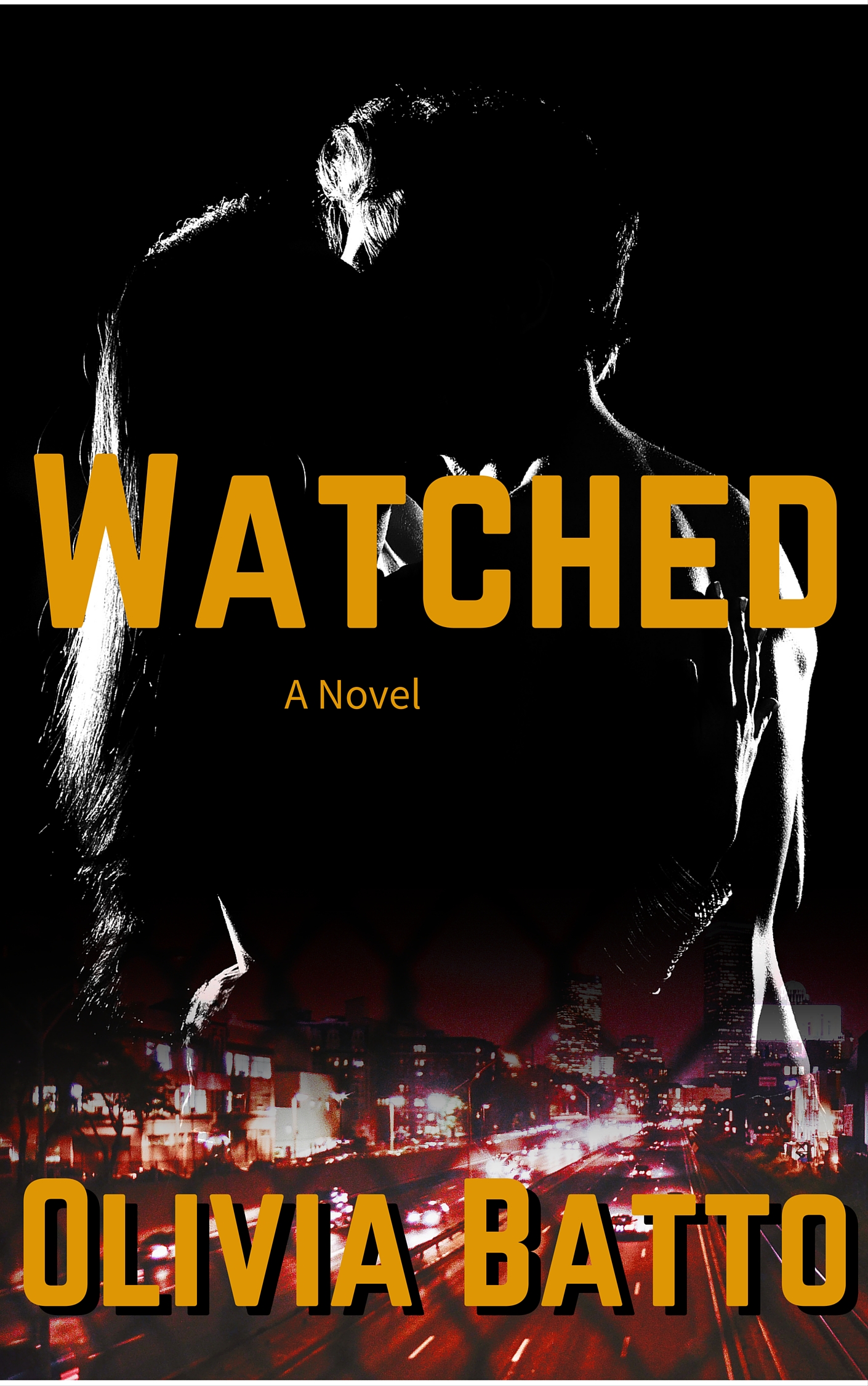
- The silhouettes are a little too black to be recognizable at thumbnail size; even at full size, it takes my brain an extra 3/4 of a second to identify what I’m seeing. Can you try adjusting the levels on the couple so that there’s a liiiittle more non-black to their shapes?
- I think there’s a bit of a clash between the monochrome top half and the full color/red-heavy bottom half. Maybe adding a subtle blue tint to the top would work.
- Sitting right over the two brightest areas of the couple image, the “W” and “D” of the title are hard to read in the thumbnail. It’s possible that adding the blue tint would solve this, but in case it doesn’t, consider adding a diffuse drop shadow (it doesn’t have to be nearly as strong as the one on the byline).
- There’s gotta be some other font you can use for “A Novel.”
- Watch your kerning. The “A” on your main font seems especially problematic — note the extra space to both sides of it in “Watched,” and the gap between the A and T in “Batto.”
Good work! Other ideas?
Not my genre, so I have only two suggestions. I think “A Novel” printed on a novel borders on insulting one’s intelligence. Sort of like printing “Coffee Cup” on a coffee cup. Maybe it’s just me, but I’d lose that part of the title. The other suggestion is to echo Nathan’s one regarding the darkness of the couple. They are a bit difficult to make out(no pun intended).
Whereas I have absolutely no problem with “A Novel.” I think the connotation is that it’s a book with a fairly universal appeal — you don’t have to be a devotee of a particular sub-sub-genre to enjoy it. (Contrast with “An Alpha BBW Shifter Time-Travel Romance.”)
Sorry but I just got to ask: What is a truck shaped weapon?
Everything else I wanted to say has already been said, so yes. Do all that stuff and this will be much better. It is already at the nearly there point! 🙂
Now I wish I had an interesting answer – unfortunately, the truck-shaped weapon is in fact just a truck.
Thanks for the help, Nathan et al.! I’m working on the cover now, so hopefully I’ll have a better update soon.
I’m glad you’re working on a revision. I didn’t want to pile on, but I honestly thought initially that the silhouette was a woman, with an updo, wearing an ’80’s suit with shoulder pads. Really.
So, making it lighter would be excellent. I mostly, really like this cover.
Probably the worst thing is having placed the title directly over the most interesting part of the cover art…leaving only a collection of white lines that have to be looked at twice to realize what they are.
I don’t think that the chain link fence effect over the bottom part of the image adds anything at all.
I don’t mind “A Novel” so much as the fact that it’s not centered.
I think it’s going to need more than just minor tweaks. There’s a whole lot on this cover that’s just too vague to work. Let’s reexamine Nathan’s critiques.
1. Silhouettes? I only saw one silhouette at first, and then only just barely: it looked like a freshly-arrived Terminator with a hairy arm and a punk hairdo viewed from a worm’s eye view from behind as he’s staring down at the city. I had to look at it again for a minute or two after reading the description and critiques before I saw the silhouetted couple. A black silhouetted couple against a black background is just too friggin’ dark, and the last thing you want your readers to experience is an ambiguous optical illusion to confuse them even further.
2. As I say, black-on-black with only broken and indistinct scraps of while is all but impossible to see by itself, never mind against the backdrop of a high-contrast red-lit cityscape. When I first saw the thumbnail, I thought this might be one of those “lurking unidentified monstrosity terrorizes a whole city” kinds of horror novels. You’d do far better to have your lovers’ silhouettes starkly contrasted against a deep red background (made of reflective foil on the physical cover, if you can afford that), and the city be dimly near-gray-scale cyan-lit instead. Also, forget the blending; while it may be a bit cliched, the sharp contrast of a silhouetted romantic couple behind a starkly delineated city skyline works just fine on romance covers. Your main task is to make the lovers stand out more than the city does; right now, you’ve got almost the exact opposite effect.
3. Yeah, your title is sitting right over several parts of the silhouette that might actually distinguish them as a couple rather than a punk-styled naked Terminator, among other problems. If I were you, I’d bring the silhouetted lovers down a bit and leave some dead space at the top so you can move your title up there to keep it from obscuring the lovers. Having the byline obscure the city is helpful, since that’s not supposed to be your readers’ focus anyway; their eyes are supposed to be drawn immediately to the pretty naked people because those are our main characters, not the city and its traffic, see?
4. How about no font at all? As others have pointed out, whether it’s insulting to the intellect or not, you really shouldn’t have to tell your readers this is a novel. The size and shape of the physical version will tell them that much already, and if you’re selling this as an e-book, Amazon always provides potential buyers with a page count and Smashwords actually categorizes its products by word count. Neither Avon nor Harlequin sees the need to put the phrase “a novel” on any of their standalone romances, so why should you?
5. Yes, you need to edge the letters on either side of that A together a little more. The space on either side makes it look like your title might be W A TCHED instead of WATCHED. Also, since we’ve already established that black-on-black is nigh-impossible to see, don’t bother with any black drop shadows behind the letters. If you want your font to look more three-dimensional (which is a good idea, since the vaguely contemporary-looking 90 degree angling adds only a very slight distinction to your sans serif font), I’d suggest having it embossed, maybe given some isometric detail. Again, if you can afford it, you might want those letters in the title and byline to be die-cut on a physical version of the cover; but even if they aren’t, looking more three-dimensional is a good thing.
To these points, I’d like to add that about half a year ago, we critics were arguing and fussing about the silhouettes on the proposed covers to another kind of romance novel (“paranormal romance” was the term the author used, though he said it was about a paranormal situation rather than paranormal beings, which made it more of a science-fiction/fantasy story). Those silhouettes were a lot flatter and more two-dimensional than these, but everyone’s main complaint from the start was not that they were so flat, but that they were of children and that they were very suggestively–some would say erotically–posed. A lot of critics were practically accusing the author of being a child pornographer, and this over a couple of silhouettes of fully-clothed face-to-face kids maybe about to kiss. (I referred to their pose as “the Eskimo nose-rub” at the time.)
Nathan and I both thought the complaints rather overwrought, but whichever way you go on that controversy, a relevant observation I’m making now is that the boy and girl posed on that cover, particularly the first iteration, had their faces apart, and yet everyone could detect a kind of sexual tension in that pose. You could surely do with something like that for the adults on your cover as well: we would be a lot more certain they were two distinct people if, instead of showing your lovers tightly embraced in a single silhouette with their nigh-invisible bodies and faces squished together, you were to put a little distance between them so that you can clarify that there are two amorous naked adults on your cover by showing them about to embrace and about to lock lips. That way, all the steamy stuff is still there, but we’ll see no more optical illusions and the focus will be firmly on the lovers where it’s supposed to be.
RK: I recall that (other) book, quite clearly. I think that the silhouette on the cover was not the main instigation of that “vibe,” on that book. If you will recall, the author interacted with us a lot. His explanations, and evasions, made it sound increasingly creepy as we went along. Yes, there was a somewhat sexually-creepy vibe in the beginning–I forget the WHY of it, now, but there was–but it was over time that the implications were somehow worse. IIRC. (Actually, in thinking about it, I think it was the body-swapping thing, with the kids in THAT pose. So, it was the mesh of the description, AND the pose that really, for me, was what made me think the “yuck” factor was too high. And the writer did NOTHING to dispel that impression; in fact, I think he encouraged it.)
(I’m glad I’m not the only one who saw a single person/creature/outline. I thought it was just getting old and bad eyes, TBH.)
As I recall, Hitch, this is what you said at the time:
As to his explanations and “evasions” and such, yes, he did interact with us a lot; but frankly, Hitch, you were the one whose attitude seemed unreasonable. As the above comment heavily implies, you’d apparently made up your mind that the silhouettes of two fully clothed kids with their noses together was “disguised kiddie porn” and to hell with anything he said after that. The word “prudish” doesn’t even begin to describe how hostile you were; in my opinion, his replies were far more respectful to you than you deserved.
I, for one, have an extremely high “yuck” factor for homosexuality; not merely because it’s immoral, but because of how the very concepts of oral and anal sex so thoroughly disgust me. Yet that didn’t stop me from giving “CB Archer” (a.k.a. Waffles) some helpful advice on his cover. How difficult could it have been for you to do the same for Mr. Coryn?
Anyway, you obviously saw a certain erotic quality to the pose of those children’s silhouettes. If it had that effect there, it could add some spice to the silhouettes of these full-grown adults to put them in a similar pose. By the same token, having them stand just a little apart from each other would add to their visibility.
One bit of artistic license on professional romance novel covers I’ve noticed is that when they have a couple posing on them (as about 95% of them do by my estimate), a great many have both partners facing the camera. In real life, snuggling and kissing in these positions is possible, but somewhat impractical; most couples would probably be more comfortable being face to face while getting huggy and kissy with each other. Considering how being face to face tends to obscure one partner or the other from the camera, however, I can see why romance novel cover designers continue to get away with this kind of viewer-friendly posing.
Showing the lovers face to face from the side is a good compromise between realism and viewer friendliness, but when doing them in silhouette as in this example, it’s necessary to have them firmly delineated to keep “the beast with two backs” from looking like a muscle-bound beast with just one back. The author’s latest revision does this with gamma correction and a new background color, which works pretty well. I still think my solution would have worked just as well, though.
Sorry, RK, but:
In your response, you say:
Are you equating homosexuality, and your ability to give civil responses to Waffles, to child porn? To pedophilia?
Yes, I absolutely did get a totally creepy vibe from that cover. Yes, it “icked” me out. As did the storyline. Maybe you missed that guy’s initial, rather lengthy description of the book that he first put up (tl/dr, perhaps?), but it was clear that there was a sexual angle strongly implied from the get-go. Maybe I read the description, and it colored my view of the book; maybe not. I can’t explain why that pose, in that scene, made me think of kiddie porn. We can’t always figure out why something makes of think of something else. I tried, repeatedly, to figure out WHY it looked as it looked, to me. I wasn’t able to pin it down to, “hands intertwined,” or whatever. Sorry if that got up your nose.
FWIW, I think that the author of that book very clearly intends for their to be some sort of sexual entanglement between EITHER the kids inside the adult bodies, or the adults inside the child’s bodies. He was VERY coy about that, and I think it’s quite intentional. When I think through all those scenarios, yes, it absolutely does set off my “ick” factor.
I went back and looked at that cover, again, a minute ago, just to be sure that I hadn’t seen something then that I wouldn’t see now. And my answer is still, no. Those two kids are posed in a pose that would clearly imply intimacy in two adults in the same exact pose. Their lips are a skosh apart, and due to the arms, it doesn’t look like they’re going to just peck-and-part, like typical tweens or younger kids would do. That’s my perspective. Isn’t that what the submitters are asking for? From *all* of us, whether you think I’m being hostile or not? If Nathan thinks that my responses were unreasonable or hostile, he’s welcome to remove them.
Did you really feel the need to insert your bigoted, offensive opinions into this, and then imply you deserve a cookie?
Who asked you?
Hello again! Thanks again for all the help, hopefully this rework fixes the 80’s lady Terminator with a punk rock updo and shoulder pads problem. It was a little like interpreting cloud formations, wasn’t it?
Hm, it stripped the image tag, let me try linking it instead.
Yes, I’ve tried that myself without much success. So far, the comments system around here doesn’t seem to allow for direct embedding of images, so we’ll just have to go on linking to them.
Your new cover is a definite improvement, but you’ve still got a ways to go. The new blue background and adjustment of the title’s position does make your couple easier to see, but the busy cityscape below them is still drawing my focus to it more quickly. Considering that they’re a lovely couple and I’m as much into steamy shots of guys locking lips with gals as much as any red-blooded American guy, the cityscape really shouldn’t be able to distract me like that.
The problem now, as I see it, lies in your color scheme, which needs to be flipped. Red and pink and mauve, it’s worth remembering, are generally the colors of passion and romance and lurrrvvve, while blue and its variants are more the colors of cool night air and relaxation and chillin’. As such, my first recommendation for your cover, for which I’ve drawn up and uploaded a demonstration, is that you invert the red and the blue on your cover.
Thanks to my editing program’s color channel splitter, that first inversion took less than five minutes to make. The next inversion, which only you can supply (if anyone can) is between the monochrome on your couple and the full color of the city; if they can’t both be in full color, then these need to be swapped. Black and white and grayscale are for stark contrasts and grim noirish atmospheres and a vaguely menacing/depressing kind of mood; color is for all of the other emotions. As such, the steamy naked couple ought to be in full vivid color, while the city below them ought to be washed-out bluish-gray or even full monochrome.
Also, while the title’s new placement is better because it’s easier to see the distinctions between the man and the woman this way, I still think it would be best if it were placed in some dead space over their heads so we could get a fully focused and uncluttered shot of these amorous lovers. Moreover, I still would rather see them framed behind a solid city landscape rather than faded into it; the color gradient by itself is sufficient to clarify that the juxtaposition between the lovers and the city is abstract and they aren’t giants making out in the presence of the city’s entire population.
To summarize: it’s better, but keep working on it.
This, by the way, is where that link was supposed to lead. I’m not sure why it linked back to this page instead.
I know, I know, I’m a total party pooper, but I don’t like the layers. The chain link fence over the city picture bugs me; it gives me the weird impression that there’s a barbed wire texture on the people.
I was going to post this. The fence doesn’t add anything as far as I can see (well, perhaps it is currently helping to blend/transition the city picture into the black background, but I think there are probably better ways to do that).
That impression’s probably just an optical illusion, but yeah, we could do without the fence.
*gets her toolbelt and goes back to work*
That’s the best option I think.
We can just stay focused on the job at hand! Let us know when there is a new version, the second one is already looking much sharper and I look forward to version three!
Congrats, folks. You just created our first locked thread on CoverCritics. [shakes head]