The author says:
Charlie Kadabra feels like the biggest loser ever born. A foster kid, abandoned as a baby, picked on by the bullies at school, he thinks his life stinks, until he tries to save the little rabbit and accidentally blows up his science teacher, who’s a robot! Running for his life, he follows the new girl, Emily, through a shiny curtain in the woods, and lands in the magical world of Mim. Charlie discovers he is the last of the Magicians, who are guardians of the land of Mim. Can Charlie find all the jewels of power for the Magician’s staff his father left him in time to save all his new friends from Dr. Pi’s destruction? This humorous fantasy tale will delight readers of all ages as they find out, there is a little Charlie in all of us.
Nathan says:
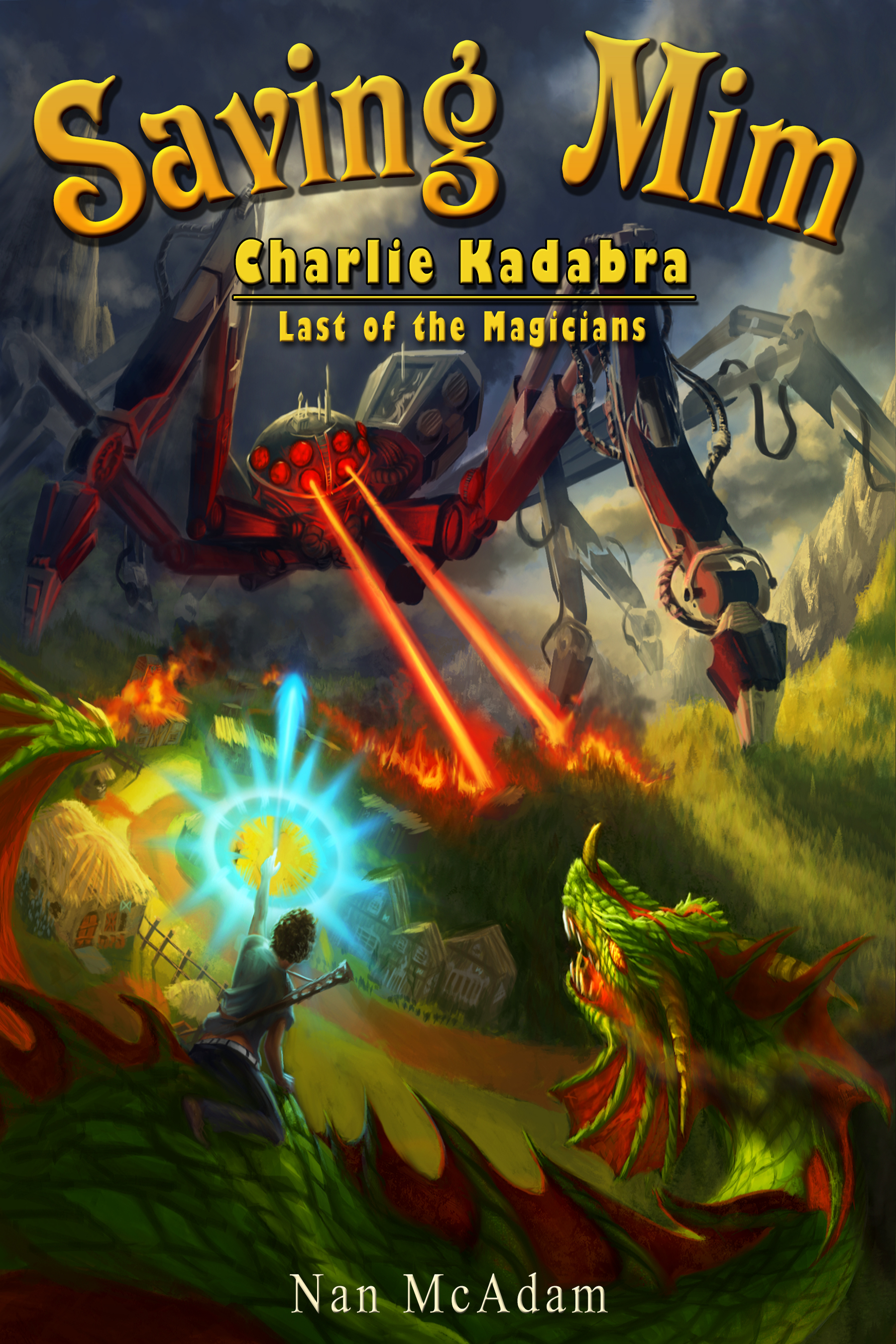
The artwork is terrific. No complaints there.
The type isn’t quite the equal to the artwork. I don’t think the characters in “Saving Mim” lend themselves well to that arc (the space between the words and the capital “M” give an off-balance feel to what was meant to be symmetrical), the font for the series title is underwhelming, and the byline… too small, too boring.
Everyone remembers the custom font for the original Harry Potter releases as “cutesy” — and it was — but it was also active. That’s what you should be looking for to replace the title font: something dynamic enough that it doesn’t need the arc to pep it up. I always recommend a max of two fonts on the cover (with the possible exception of a pullquote, which needs to be readable above all else), so I’d recommend one font for the title and a second for the series title and byline. remember that everything needs to be readable, and smaller type is harder to read anyway, so whatever font you pick for the subtitle needs to be easily read at those sizes.
I would also recommend that you put the series title on one line — “Charlie Kadabra, Last of the Magicians.” Otherwise it seems like you’ve got a book title, followed by a series title with its own subtitle. Titleception!
Anyone else?
Hi, gang: full disclosure, this is a Booknook.biz print/eBook client (remember, we are not cover designers). Nathan, do you have any suggestions for the fonts? Anyone else on the fonts? I agree, I think that the artwork is awesome and so much more suited to the market, which is Middle Grade/YA Fantasy.
Thanks for feedback, guys, my client will really, really appreciate it.
That is TERRIFIC artwork!
The author’s name needs to be MUCH larger and spaced out a bit to go across most of the width.
For the title font, how about something resembling the old pulp magazines? They had very lively, bold, exciting fonts and the dragon/robot mashup deserves it.
This is some rather busy artwork I’m seeing, but it does suit the energetic description. I take it from the kid with the magical light effects riding the dragon and the giant spider-tank with the village-wrecking incendiary beams that this is kind of a magi-tech story, combining some science fiction elements with the fantasy? At any rate, it definitely looks and sounds like something targeted at young video gamers, particularly with the part about collecting all the jewels of power for his staff. For this old 8-bit gaming enthusiast, it brings to mind a kind of “8 Eyes meets Astyanax meets Monster Party” plot.
Actually, the artwork’s so beautiful and well-done that it almost seems a shame to have to overlay any lettering on it at all. I agree with Nathan about the title, though I think the font looks dynamic enough already without needing any curving; just lay it out straight and kern the a and v and the n and g in “Saving” a little more tightly; the gaps between them are a bit too wide.
As for the series title… you’re sure you need that at all? The artwork has pretty firmly established the kinds of adventures this Charlie Kadabra kid is going to be having, and all anyone needs to do to find out his name and family status is flip the book over and read the synopsis. Anyway, if you must include this series title, can you maybe shunt it to the bottom with the byline so we can get a clearer view of that awesome spider-tank? If you’re going to follow Nathan’s advice about the fonts, the series title and byline would look better together anyway.
As for the byline… Well, yes, it is rather boring right now. Light-mono-with-serif is about as generic as you can get, being difficult to distinguish from Times New Roman and Microsoft Serif and any of about a gazillion other such fonts. The byline actually isn’t all that important for the present as the author isn’t an established name (at least, not so far as I know), but it would be good to enlarge that byline and use something a little more dynamic and unique, such as the series title font.
Also, bear in mind that Nathan’s recommendation of two fonts is a maximum. It seems to me you might be able to do everything with just one font, particularly if it’s that lovely engraved-looking fantasy font you’re using in the title. If you need some variation, adjusting the color of each title and the byline to fit the artwork’s color scheme may also help: fiery golden-orange for the spider-tank’s beams, bright plasma blue for the kid’s magic bolts, and deep red with bright-green highlights for the dragon he’s riding, properly placed, can make the text both stand out from and blend in with the gorgeous artwork, making it just as eye-catching and visually satisfying. That’s the effect you want.
Hi, guys:
I do think that spreading the byline, with a better/crisp font (something sans serif–perhaps a new subtitle font could do dual purpose) across the bottom would be a good balance, IMHO. Like Veronica Roth’s name on Allegiant’s print cover, mayhaps. http://www.creativindie.com/wp-content/uploads/2013/10/allegiant-book-cover-high-res.jpg (courtesy of mooching from Derek Murphy)
That’s my $.02. I’m so pleased with the replacement cover, however, that I could easily overlook the font flaws.
More feedback, guys and gals?
Hitch
I like that font on the Veronica Roth book. Maybe spread across the top of the book for the series name with a small tooling line beneath it, then larger and spread across the bottom for the author name. I actually really like that font for the book title, and maybe taking out the arc and toning down some of the other text effects might look a little better. I would also make the author name text either the same color as the series name or the color of the book title; three colors seems too many.
Yeah, me too. (The Veronica Roth font). I didn’t look at it in minute detail, but I could probably replicate it fairly quickly. I’m very font of sans-serif for book covers, chapter heads, title pages, (websites, obviously), etc., although not for body text. I wish that the cover designer had put the client’s name across the bottom, but I suspect–knowing her–that she was too shy for that. Just a guess, but…an educated one.
The artwork is nice, indeed, and I couldn’t agree more with everyone about the type.
However, some of the problem with the type is exacerbated by the art. There is probably nothing that can be done about that now, but it should be something the artist ought to take into consideration when creating the artwork for future book covers. And that is leaving enough space for the title to be added. Most professional book cover illustrators leave at least 1/3 of the space unoccupied by important details. For instance, check out the cover art created by Steve Hickman
http://www.stephenhickman.com/sf.html
Where he doesn’t incorporated the title into the painting itself, he leaves plenty of room for the designer to add this.
The Mim illustrator unfortunately made it extremely difficult for the designer to effectively add the title, author and other information. Hopefully, this is something he or she will avoid doing in the future.
Well, Hickman’s gallery being dreadful to use notwithstanding, (sheesh), yes, in most of his layouts, there’s room for the title. Although not necessarily more than that. If you look at Gryphon–which, as apiece of art, I *really* like, mind you–while you could override the top, for a title, you’d be screwed for a sub-title, and the byline. IMHO. I think you’d end up using it between the dreaded bars. (I suppose you could put a white/light byline over the characters’ feet…)
I concur that the Mim illustrator could have made it better for the final titles–although, my understanding is, he’s the artist AND the cover designer–but that may well just be inexperience at Cover design itself. The artwork is certainly FAB.
I want to thank everyone who’s been kind enough to leave feedback for my client. You guys iz de bestest!