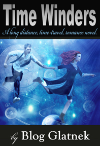
The author says:
A time travel novel with a strong, female protagonist.
Nathan says:
Hmm. You didn’t give us a very big image to examine, so we can really only critique it as a thumbnail. There’s only a very short description to compare it to, so forgive us/me if the advice we give doesn’t match the novel well.
First: Fonts. My rule of thumb is that, unless you have a compelling reason, try to limit yourself to two typefaces. I don’t think you’ve got a compelling reason; what’s more, the most difficult-to-read font is used for your smallest text. (Another rule-of-thumb: The smaller the text is, the easier you should make it for the reader to read.) And your largest type, your title, is in your most boring font. I understand that big, bold sans-serif typefaces can appear strong, but I think this one misses the mark.
Second: Cover vs. description. All that we know about this time-travel novel, really, is that it has “a strong, female protagonist.” If that’s the most important thing you want the reader to get from your cover as well, then the image should concentrate on the female character more than the male; as it is, they have pretty much equal visual weight. I don’t know if the original artwork has cropped-off portions; if it does, you might want to crop it differently so that the female is central and the male is off to the side and partially cropped.
Third: Layout. The pattern you use — am image in the middle, completely separate from text above and below — is more often used for non-fiction than fiction books. Again, if the original art allows it, I’d recommend the text go on top of the image.
Fourth: The words. Maybe it’s just me, but I really dislike subtitles which essentially tell us the (sub-sub) genre of the book. Maybe it’s because you see it more in crank-em-out erotica ebooks: “A Polyamorous BBW Shifter Billionaire Romance,” etc. I’d recommend something more like “A Romantic Adventure Across Time” or somesuch — something that tells the reader about the contents without seeming like a taxonomic classification.
Fifth: The words, part two. I understand why you have “by” in front of your name; it’s such an unusual name that readers likely wouldn’t immediately identify it as the byline. However, the “by” just seems like it sticks out there uncomfortably. You could solve the problem by combining it with the tagline and putting it just above the byline — “A Romantic Adventure Across Time by” — instead of under the title.
I really want to do a five-minute mock-up to show you how these fixes would fit together, but the small size of the image you’ve given us doesn’t lend itself well to that.
Eh. what the heck. Here’s something.
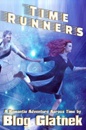
These aren’t the fonts I would go with for the final, but I think this gets across all the ideas I was trying to spell out.
Anyone see something different?
Nathan: My quibble with what you’ve said and mocked-up is solely whether or not that font style is appropriate for the genre. If the aim is sci-fi first, that style of font (strong, angled, “modern-ish”), is fairly groovy. If, however, it’s supposed to be heavy on the romance, and less heavy on the sci-fi/paranormal/time-travel aspects, then the author…Blog….might want to look for a more romance-y font.
Given, however, that the author him/herself has used a big sans, for the title, I’m going to assume that something like Ballroom Tango is out of the question. Cumulus might work here; (I personally like Caviar Dreams, a lot, for these type of less-determinate, many sub-genres novels that verge near sci-fi; plus, the pseudo-Art Deco feel of DC might sell time-travel, a bit). n.b.: those recommendations assume that the solid black background remains; they’re both kinda light if you’re going to use them on a varied background like the base image.
I don’t know. The artwork is fairly strong on its own, what little of it I am able to see. I assume that the socks are explicated somewhere. I would absolutely lose the black borders top and bottom, I don’t think that they’re helping at all. I am assuming that you’re using them because you struggled with color, for the font, against that blue background, but I think Nathan’s shown you a direction you can take with that, instead of trapping the cover between bars.
FWIW.
Hitch,
I’m the author, Tanya (female). Blog is the narrator/writer of the novel (he’s in the future, submitting the book for our enjoyment), and it is heavy on the romance.
I’m still reviewing your font suggestions; thank you!
Re: “I am assuming that you’re using them because you struggled with color, for the font, against that blue background, but I think Nathan’s shown you a direction you can take with that, instead of trapping the cover between bars.”
I AM struggling with font against the blue background. Please take a look at the new submission.
Your re-do is certainly an improvement…the cropping alone is a great idea. Even though the original images are little better than thumbnails, there are still things that could be obviously made better. The main thing, of course was to get rid of the black bars in order to take better advantage of what looks to be a halfway decent piece of art.
Whatever aspect of the book the author chooses to emphasize via the choice of type, it does need to be something better than the rather bland one presently used. Nathan’s example is an excellent possible alternative.
Hi!
I (Tanya Park, female) am the author. Blog (male) is the futuristic narrator of the book.
I submitted a small cover because didn’t want to submit a cover, “…big enough to choke a horse.” Sorry!
Nathan: Your cropping is a great idea; thank you. I’m still changing the cover.
Hitch: Ouch! She’s wearing leather brown boots, not socks. I’ll have to change this.
Ron Miller: Black bars are gone.
Thank you everyone for your comments! Let me know what you think. I’m still updating/changing cover.
I GREATLY appreciate the feedback!
Sincerely,
Tanya.
Hi Tanya,
Unless you want “Blog Glatnek” to be the pseudonym it’s published under, then you might want to change how you credit the book on the cover — since you really still ought to have YOUR name on the cover, as the unambiguous author. I’d suggest maybe a subtitle like “Blog Glatnek’s Adventures Across Time.” At the very least, “By Blog Glatnek (As Told to Tanya Park).”