The author says:
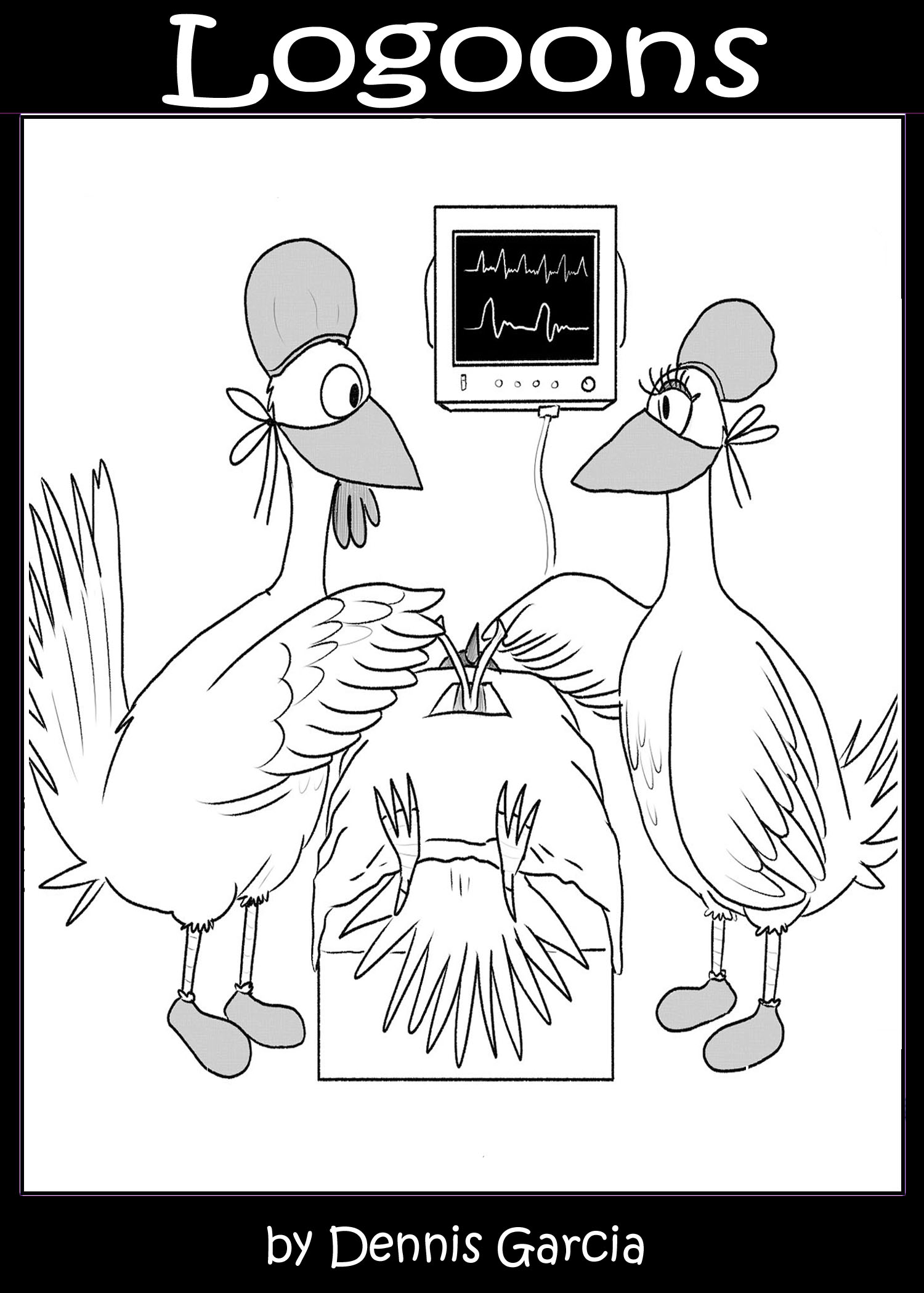
The title is a portmanteau of logo and cartoons. I wrote (and hired a cartoonist) 120 single panel gag cartoons. The cartoons are built around a word and its definition. Not multi-syllabic words no one cares for or could ever remember (except for a couple I couldn’t pass up), nor highly technical jargon, but interesting words rarely used in the banter of daily conversation. Readers expand their word knowledge and get a good chuckle at the same time. The prospective cover, for instance, is of one of the cartoons (attached to this email). I’m attaching a couple more cartoons to give you a better feel of the book.
I would be very interested in hearing other voices ( bad choice of words there) in hearing other people’s opinions of the book cover. I truly appreciate the help you and your group offer.
(I’m thinking of putting in a splash of color – perhaps yellow on the feet of the chicken patient and pale blue coverings on the chicken surgeons.)
Nathan says:
Thanks, Dennis. I hope our comments are as helpful as you expect. (Bring your A game, folks!)
I definitely agree about the color. In fact, I’ll go one further: I think you should fill that big white background space with color, maybe a light blue. Even the covers of books of entirely black-and-white cartoons should be colorful. (Look at the covers of any of the Dilbert books.) And the black border? Make it a color — either a darker version of the light blue, or maybe a burgundy.
While you’re at it, you don’t have to put the text entirely outside the borders of the cartoon; that’s a lot of wasted space. there’s plenty of room beneath the end of the bed for the byline, and the title could even drop until it starts to overlap the medical monitor.
Anyone else have thoughts?
They are performing open heart surgery and they are going to break the patient’s wishbone in half during the surgery in order to make a wish? Look at the vitals, that patient is still alive! Without a wishbone it will die! Die!!
Are those chickens INSANE!? They are killing him! Killing him!
…
Uh… I mean… I think that this should be in full colour to make it more pleasing on the eyes.
LOL.
Thank you for your input, Waffles. Putting in color does sound like a good idea.
Dennis
What’s the ‘word’ for the cover pic? I’m wondering if its presence on the cover may help to convey the concept. The title is lost on me. The explanation blending logo and cartoons isn’t helping me either, I’m afraid (perhaps it refers to the word and its related cartoon, or is there more to it?). But if adding the word for the title pic could remedy that, it might be worth considering. In part the cover should attract (some color may help) the target audience, and in part it should send a clear signal about what to expect.
Thank you, GP. The word is furcula. The long definition is
a forked bone found in birds and some other animals, and is formed by the fusion of the two clavicles. The short definition, which is what I used for the book, is the wishbone.
So the top section of the panel contains the words:
Furcula (noun): the wishbone
There’s some speech bubbles in the cartoon, too.
I had a subtitle which I considered putting in, “Gag Cartoons from Word Definitions.” Maybe if I did include that it would send a clearer signal.
Thank you again for your advice, I truly appreciate it.
Dennis
When I first saw the cover thumbnail, I thought maybe we had another designer looking to copy the style of a cartoonist for the New Yorker like that previous entry, Survival of the Fittest. On reading the description, I see that’s not quite what you’re doing, but fairly close. The Dilbert books are one possible professional style worth considering for inspiration, yes. Since this book clearly does bear some resemblance to those New Yorker comics, however, I also recommend studying and taking inspiration from the professional covers of several actual collections of (rejected) New Yorker comics compiled by one Matthew Diffee: here, here, and here.
Note that on all three of these covers, the comic panel doesn’t take up quite so much space as on yours, leaving more room for the title, tagline, and byline. Note also that a simple outline along the margins and the boring-but-immediately-accessible font gives these cover designs a rather professional feel to them even before you actually look at the comics (which, since they were rejected, are each presented on a crumpled-up piece of paper). Whether you go with color for your cover’s comic and/or background or not (the second example has color in neither place and yet still works just fine), you should definitely include these other elements to give your cover that same professional feel to it.
As for the comic itself, maybe it’ll work, or maybe it won’t. Which word is it intended to illustrate? If this is a sample of the comics within, why not show the comic’s entire page, complete with the caption indicating what word it illustrates, as it will appear in the book? I know you haven’t printed the book yet, but it should be a small matter to print out that one page from your book on your printer at home, and snap a photograph of it which you can then put on the cover just as those New Yorker collections did on theirs. Slap that into the middle of the outlined background (optionally filled with some solid color as in two of the examples provided), and you’re good to go.
Thank you, RK.
I looked up the links in your reply – I do see how I can reduce the image size which would allow for more informative text. Give the readers a better idea of the gist of the book with a split-second glance, which can truly make a difference in a sale or a non sale.
Thank you for your advice, I intend to use it.
Dennis
I agree that the title and author’s name look like afterthoughts, crowded into the top and bottom of the art.
I also agree that the title itself—“Logoons”—is meaningless until you read its derivation. Until then, I suspect a few too many people may see it as “Lagoons.” The idea behind the title should be clear at a glance.
Thank you, Ron.
All of you have definitely given some very helpful insight and advice.
You hit the nail on the head about the title. It was definitely something that eluded me – no one else would know at a glance what it means. I will definitely rectify that and apply a lot of the suggestions I have so far received.
Dennis
And thank you, Nathan. I have looked up some Dilbert book covers and I totally see what you mean!
PS
I meant to include this bit of information and completely forgot.
The surgeon and nurse’s speech bubbles:
Dr. Nutters: “Oh Nurse Ivana, I got a hold of the furcula.”
Nurse Ivana: “I do too, Dr. Nutters.”
Dr. Nutters: “You know, I applied for that coop in St. Croix. Shall we?”
Nurse Ivana: tee-hee
My only comment would be don’t use that font. I’m sure a lot of folks wouldn’t mind it, but I just don’t think it says “book cover” font. Especially don’t squash the font if it’s unsquashed at the bottom where the author’s name is. (Are my eyes playing tricks on me? Because it looks like the font is slightly squashed up top.)
Thanks for the feedback, Matt. I’ll take that under advisement.