The author says:
A fantasy set in medieval times, Nara sets out on her spirit quest so she can take her mother’s place as Duchess of Tinn, along with her companion, Barris, and his dragon, Bramble. Along the way, a 1,000 year old spell is broken, releasing a murdered man’s heart and soul from the bodies of Barris and Bramble, turning him back into his true form of Prince Brogan. The new duo complete the task, but along the way, find that Nara’s home city lay in ruins, her father is dead, and her surviving family and friends are in hiding. The queen, banished 1,000 years ago, has taken over the territory with plans to take control of the kingdom. But the son she murdered will stop at nothing to keep that from happening.
Nathan says:
So, my assumption from the description and the current cover is that this is in the “grim fantasy” subgenre a la Joe Abercrombie. Yes? I hope so, because my comments are going to be informed by that assumption.
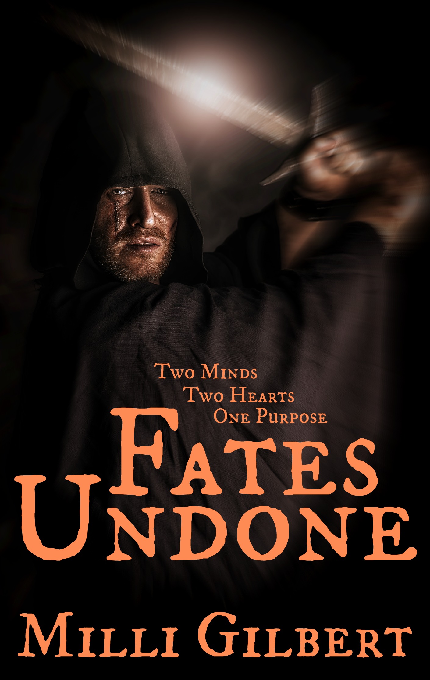
The best covers for grim fantasy novels have a muted color scheme, as yours does, but I think the most successful of them also have a “gritty” feel to them, which yours does not. I attribute that largely to your type treatment: the color is a continuation of the main hues of your cover image, and the semi-medieval font doesn’t add and information or excitement to what the image tells us.
I think one of the best examples of a cover for the subgenre is this one:
![519kPrCXRKL._BO2,204,203,200_PIsitb-sticker-v3-big,TopRight,0,-55_SX278_SY278_PIkin4,BottomRight,1,22_AA300_SH20_OU01_[1]](https://covercritics.com/wp-content/uploads/2015/01/519kPrCXRKL._BO2204203200_PIsitb-sticker-v3-bigTopRight0-55_SX278_SY278_PIkin4BottomRight122_AA300_SH20_OU01_1.jpg)
The artwork shows visual elements readily identified as “fantasy” (or at least “pre-modern”), while the type treatment wouldn’t be out of place on a police procedural or gritty “FBI vs. serial killer” suspense thriller.
So my advice is to play mostly with the type. Try something that’s not usually a fantasy font, something heavy and sans-serif. I’d probably put it in white, as here, and add a slight grunge texture to it (slight enough that it doesn’t interfere with readability).
And if you don’t intend for this to be a grim fantasy, well, come back for an entirely different set of advice.
(One non-font comment: I’m not sure that the blur in the image really helps. Yes, it lets us know that the face is more important than the hands, but simply playing with the contrast could do that as well.)
Anyone else?
Somehow it looks a little unfinished, as if it needed more texture or something, otherwise I think it looks good as it is, except the colour of the font… salmon pink? Nude? While it fits the colour scheme, it does not quite fit the feel of the cover or genre. I would rather see white with texture, as suggested, or some other colour.
The unfinished feel is probably because of much smooth colour: the picture has an untextured background, it is a photo so lacks the textures of painting or drawing and the font is also completely flat. Probably just adding texture to the font would already make it look more ‘pro’, more done.
In addition to washing out the colors a bit (near-sepia-tone looks like it would suit this particular cover), see if you can give the guy’s face just a little more expression. His pose says “I am about to chop your !#*%$@ head off!” but the look on his face says “Another Tuesday night chopping heads… BORING!” Unless you’re actually going for this look of sociopathic apathy, try curling his lip in rage or squinting his eyes in grim determination or portraying him laughing madly like a berserker or, you know, putting whatever emotion is typical of him on his face.
I would ditch the blur, zoom in closer on the face, and do some processing to the picture to get that “300 look” that seems to be emblematic of gritty fantasy these days. There are several tutorials for that online, or you could use another version of the stock photo – http://www.123rf.com/photo_26351108_portrait-of-a-courageous-warrior-wanderer-in-a-black-cloak-and-sword-in-hand-historical-fantasy.html or http://www.123rf.com/photo_25191834_portrait-of-a-courageous-warrior-wanderer-in-a-black-cloak-and-sword-in-hand-historical-fantasy.html for example. Right now it looks too much like a picture of a guy Larping, when it should look a little more artistic.
It’s hard to make anything out in the thumbnail. Up large, I don’t like the blurry sword. I gather it’s the effect of being swung, but my eye tends to be repelled by covers with blurry elements when I’m browsing covers. Comparing your thumbnail to Nathan’s example, there is no doubt that I would check out that example instead. (But maybe that will change when this cover is perfected.)
As usual, Nathan is pretty spot on here. A new font is a must. Lose the blur, it is unnecessary addition a indicates a certain laziness on the part the of the artist in that blur treatments are often used as a gimmick to hide deficiency in detail; detail that is important here I think. Again, more than any other cover art, the fantasy art itself has a huge following with websites dedicated to that type of art. Therefore, it is not only important that the art be solid, it’s critical. If you look at the example Nathan posted, you can see the blur effect used properly on the background battle. If employing the blur is important to youp3rhaps you should consider adding more components to the background of your sword-wielding character and adding blur to those.
As a side note, I would personally be very interested in reading a post by Nathan where he discusses the varying importance of imagery on the cover of books, especially how the importance of style and composition varies between genres.For example, it is my impression that the fantasy genre is far more demanding in terms of art quality than some other genres. Am I correct in that impression? I think it would be an interesting and helpful article for the readers of this site.
I’ll put that idea in the brainpan and see if anything useful comes out.
Sorry for the typos, but there’s no edit feature here for me to use to hide my typing fails. 🙁
Damn. One other thing I meant to mention is to tone down the sword glint. Currently, it creates a conflict of lighting based on the lighting of the character’s face.
OK, now I’ll shut up.
Don’t shut up. Insight is insight, even if it pops into your head 4 minutes later. 🙂
I didn’t even notice it because of the blur, but that lens flare should be toned way down.
I agree with everyone else that I’d lose the motion blur and the highlight on the sword. Otherwise the image is very nice, but I keep looking at the sword and going “Is that really how the motion blur would look?” (If you want a blur in order to keep the focus on the face, I’d just use a Gaussian blur.)
I have to add my vote for ditching the blur. It absolutely does not work. Ditto the glint…the eye goes directly to it.
I would also try to bring out a little more of the detail in the art without losing the overall effect of the darkness.
For what it’s worth, the “man-in-a-black-hooded-cloak(-sometimes-holding-a-blade)” motif is what’s killing it for me. I read fantasy about 90% of the time and this is just far too common in cover art, especially in the past 5 years or so. It really makes me pass books right on by at this point. (A couple of Michael J. Sullivan’s Riyria books have this, Mark Lawrence’s Prince of Thorns has this, there are three books by Jon Sprunk with “Shadow” in the title that have this, there are three books by David Chandler with “thief” in the title that have this, and that’s just what I can think of off the top of my head.)
Yes, and I have started to take note if any person in the narrative is mentioned to be actually wearing a hood – often that is not the case.
Thanks everyone for the insight! I’d rather perfect my creation here than have it look like crap when it’s published. I don’t have photoshop, so my options are limited. I used the free options on PicMonkey to do the design. I’ll probably still hire it out, since I’m not designerly inclined, but the feedback is still awesome, so thanks to all!
You don’t need Photoshop. I do essentially all my design work in GIMP, which is free.
I think that’s all good advice about the photo.
With regards to the title and byline you haven’t made a bad start, but here’s my advice:
The fontshould be stronger than this. I can see why you picked this font (GrandJean?) because it has an old-fashioned look but it’s actually redolent of the wrong era for your book – it looks like a8th century print.
I wouldn’t try for something old/fantasyish. Pick something that is appropriate but more neutral. Obviously you don’t want a futuristic font on a fantasy book, but I’d pick something a little more neutral and definitely sans-serif. The font ‘Overhaul’ is good places to start.
The thing with any decorative or distressed font is that you need to be wary about at repeated letters. For instance in your type above, look at the letter ‘n’ as it appears twice in the word ‘undone’. They are identical, of course, which undermines the hand-done effect you’re trying to create in choosing a distressed/uneven font. When I use distinctive fonts like this I have to expand the letters into graphics and edit them manually to compensate for that effect.
Whatever font you choose, you’ll need use texture to distress the type a bit so it doesn’t look unfinished.
The colour you’ve used for the type is also wrong. It’s a particularly mawkish shade of orange anyway, not exactly speaking of drama and excitement, but actually I think orange is the wrong colour scheme for the type altogether. And orange/brown tint is the ONLY colour in your cover-image so using it in the type too makes the whole thing too flat for my liking.
I’d give white-cream, sky blue and gold-yellow a go for a start.
You’ve made a good job of giving the title a distinctive lock-up, having the top line sit neatly framed by the lower line, and the tagline on top of the whole thing. I think this arrangement would be strengthened by reducing the kerning quite a lot – at the moment there are bigger gaps between some letters than between the two lines which always looks odd. With a sans-serif font the letters will sit more neatly alongside each other so you can bring them in without ear of overlap.
Plus it will bring the edges of the title-graphic in, giving it a little black space either side so it works more as a graphic shape.
Maybe play with increasing the size of the tagline, and veering more to a right-align? At the moment I feel like its encroaching on the image because it’s too centred. I think you can leave this part in the current font, and possibly the byline. see what works with whatever font you use for the title.
Finally, bring the title/tagline lock-up down a bit. You want a little space between the bottom of the title and the byline, yes, but at the moment there’s needless amount of black space there. This will also have the effect of bringing the top of the type section down away from the halfway point. At the moment, the top of the ‘two minds’ line is sitting almost exactly halfway up the cover, and that too evenly divides the cover in half, rarely a good design choice. The rule of (rough) thirds works better: have the title occupying the bottom third of the cover and the image occupying the top two-thirds. Have the tagline, shifted right, leading from one quadrant into the other.
Here’s a very rough layout guide to show what I mean: http://nestofstraightlines.tumblr.com/private/109293672981/tumblr_niu5btIjJ41rv70iu
I just ran this cover through tineye, and it’s turned up a rather interesting stock photo. The color shift and slight blur on the sword wasn’t enough to fool the reverse image search, it seems.
By the look of things, you probably paid good money to get the full-sized print of that stock photo, which is a pity because that gleam on the sword is really distracting and difficult to remove in a photo editor. Besides, something almost certain to happen sooner or later is that someone else looking to make a “grim n’ gritty” fantasy novel is likely to get the very same idea and go get themselves the same photo to put on their cover. I don’t recommend going with this particular picture.
My advice: find yourself a medieval weapons enthusiast or cosplayer or some Renaissance Fair reenactment player to pose with a cloak and sword, or (depending on your looks) go borrow a sword and cloak and pose with them yourself. Promise anyone who’ll assist you with this fame with your readers and maybe a friendly kickback if your book succeeds, and do a photo shoot with a high quality camera and someone who knows how to use it. That way, you’ll have a unique picture for your cover, you can give whichever character is supposed to be represented on the cover an emotionally appropriate pose and facial expression, and the sword won’t have that annoying “lens flare” on it to distract your prospective customers.
Let me reword something RK says:
Have a PROFESSIONAL PHOTOGRAPHER (or a professional-grade amateur) do the photo shoot. Too many non-photographers think that they can fix anything that comes out of their digital camera in PhotoShop, but even PhotoShop can’t fix bad composition, lighting and shadow, etc.
Um, this guy looks a lot like this one.