[Original submission and comments here]
Nathan says:
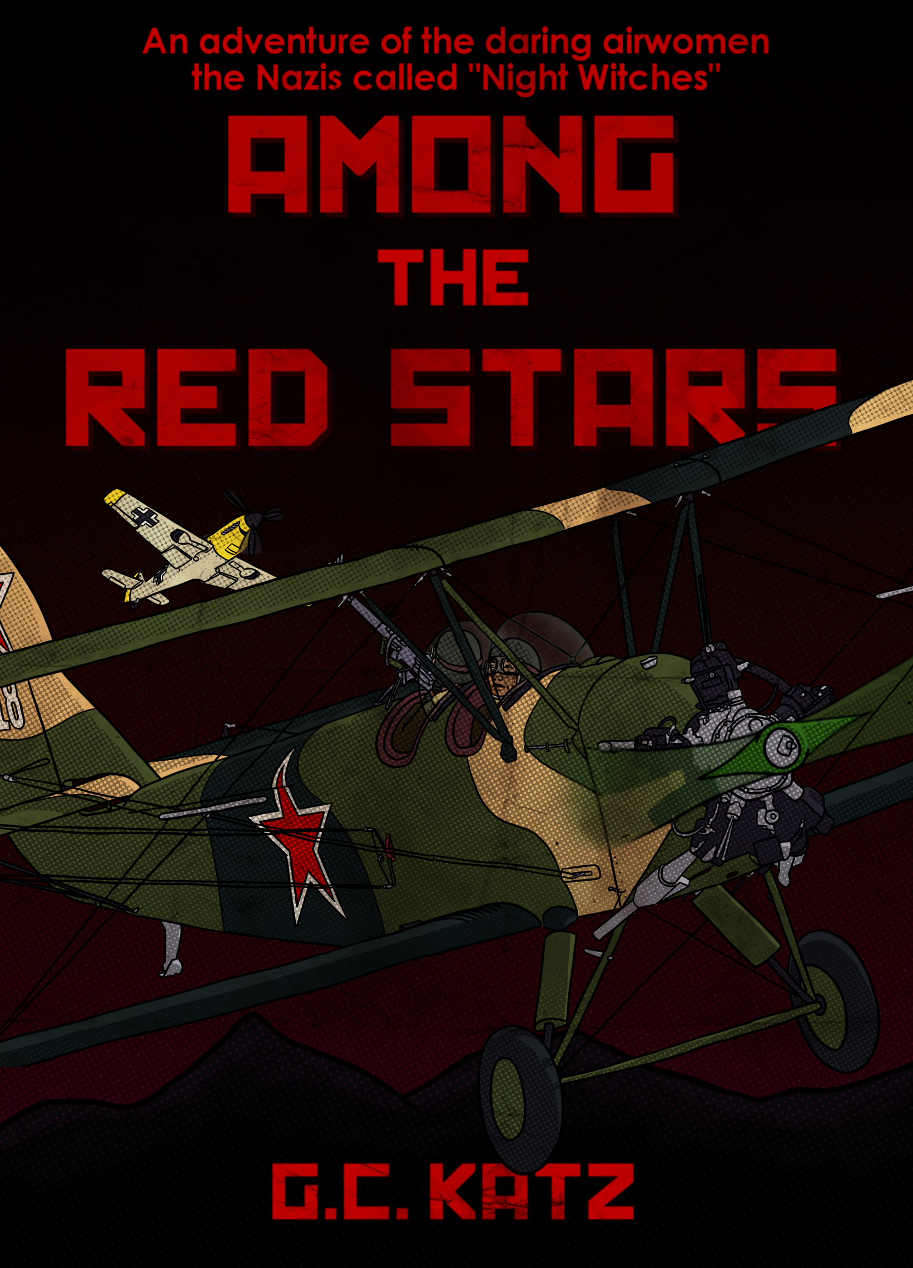
Quite a lot of little tweaks here, most for the better. Here’s what I’d still have on the to-do list:
- Still more contrast to the artwork. Until I can clearly tell in the thumbnail that I’m looking at an airplane, the artwork’s not doing its job. (If you’re hesitant to lighten the foreground airplane further, maybe you could try increasing the red sunset glow behind it to make it stand out.)
- Play with the font for the supertitle text — perhaps something serif and period-appropriate.
- I’d make it “daring Soviet airwomen.”
Other ideas?
Nathan is right: The art is simply too murky.You need to enhance the contrast between the aircraft and the background. Nathan’s hint about perhaps working with the background might be worthwhile pursuing. Instead of a flat black sky, make it a more realistic night sky. You could have a midnight blue instead of black, a moon, moonlit clouds, stars, etc.
(I only just this moment realized that the background is not flat black: there are in fact some mountains silhouetted against a dark red sky that shades to black. Since my impression was of a black sky, this might be a clue that the sky needs to be enhanced.)
It still looks like a good cover, and the planes stand out better. I still think red does not stand out very well against black, which is why actual posters of the era almost never seem to use it (red or black on white, or the other way round, are more common). It would possibly work better if the font was edged with white? Here is an example of a hand: http://media-cache-ec0.pinimg.com/236x/72/3b/0b/723b0b53b841ecfb2c7476345ff089b3.jpg
I have quite bad eyesight (ahh, the negatives of getting older than you’d like to be), and I find the red text too hard to read.
And until I read Ron’s comment, I thought the background was plain black too .
My point being, I would skip over this book during a search because it hurts my eyes too strongly.
Red and black do not contrast well. So many people assume that ‘red’ is so bright and eye catching that it is great no matter what. The reason why red has such great contrast though is because the eye very much treats it like black. This gives red great contrast with most of the same colours that black has great contrast with. Namely white.
The red on black is hard to read problem is compounded because the sky has hints of red in it, which lowers your contrast even more.
I know you want the title in red, because the word red is in the title. You are going to need to add contrast for legibility.
Your byline does not need to be red. It can be white.
For the rest you should consider either a much much lighter background that isn’t black or red heavy, which would help that plane stand out, or using an outline on the text.
It is called among the red stars after all. The background can be non red, just make sure you have some red stars in the sky!
For anyone interested, here’s the cover it ended up with:
http://www.yabookscentral.com/blog/it-s-live-cover-reveal-among-the-red-stars-by-gwen-c
Hire a professional. They’re good at what they do.
I totally approve of the new cover.