Month: January 2018

Catslay [resubmit]

The author says:

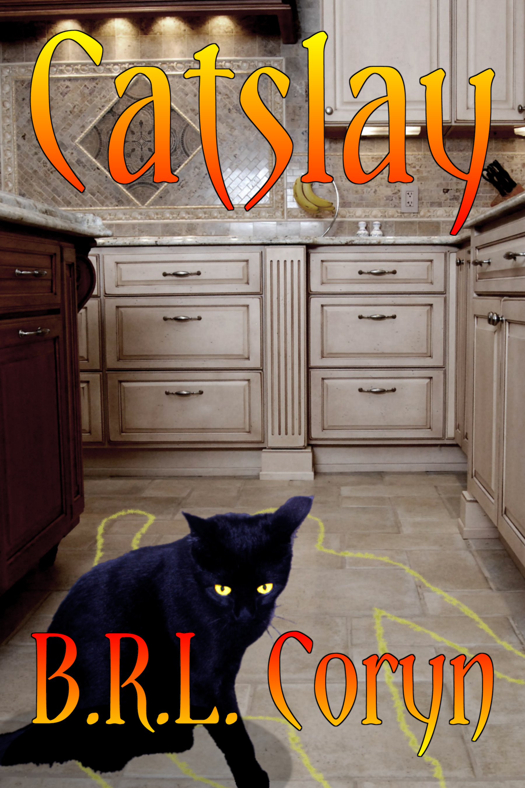
Basically, this is a novel about a boy who gets turned into a cat and then eventually takes up a career in killing evil people. For further details, see the description on my earlier submission when this was called Catslash. (I changed the title because for all of the slaying taking place in this story, none of it is actually done with bladed weapons or claws as a literal reading of that title would have suggested.) While it’s a bit more sophisticated than my first cover, this is still just a scratch cover. I’d much prefer to show the protagonist standing over an actual corpse rather than a chalk outline (especially since that’s a television cop show cliche; real police don’t actually do that), but so far haven’t been able to find a suitable stock photo of such.

Genre: Suburban Horror-Fantasy, which is basically the same thing as its Urban counterpart, but with the setting being mainly in various relatively affluent and wholesome-seeming suburban neighborhoods rather than gritty inner-city ghettos.

[original submission and comments here]


Nathan says:

The cover’s completely different, but the same criticisms hold true:  Your book doesn’t look like any variety of urban fantasy.  When readers who like urban fantasy are look for their next read, this is what they expect to see:


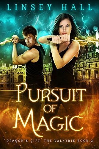
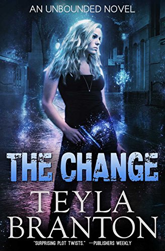
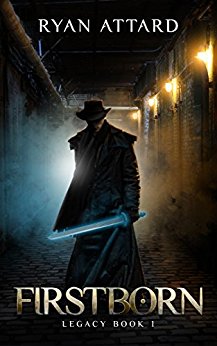
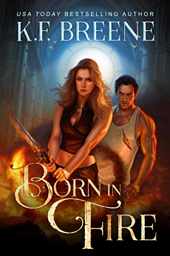
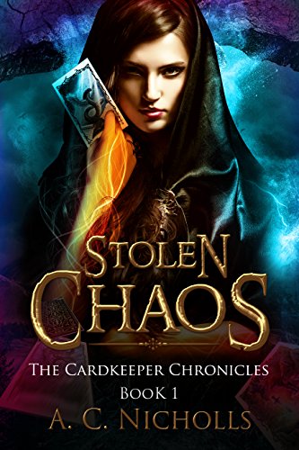
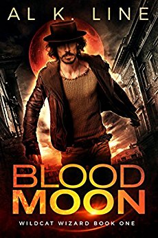
Protagonists. Dramatic colors, with lots of highlights and shadows. Nimbuses (nimbi?) and glows and arcs of energy.

If you are trying to appeal to that audience, you need to market your book in the manner in which your potential readers will instantly know that this book is for them.

You’ll either need to (a) break down and hire a cover artist, or (b) at the very least, brows Deviantart.com and similar sights for finished artwork which you can license.  Note that the cover does not need to be a literal interpretation of an event or setting from the novel; it needs to say, THIS IS AN URBAN FANTASY AND YOU WILL ENJOY IT.

Other comments?

High and Low

The author says:

Hi, I am the author of this book. This is not ready for publishing cover, but the design is (hopefully) complete.

About the book: This is a non-fiction memoir about a 600 mile hike whilst coming to terms with depression. The hike took place in 2015 in Scotland. Target audience both male and female, ages between 20 to 60, those who enjoy outdoor adventures, and those seeking help with depression.

Nathan says:

I don’t really have any complaints as far as the technical aspects; a thin gray border would keep the white of the cover from bleeding continuously onto the webpage background, and I’m not a fan of the mottled toning around the figure, but neither of those is a big concern.

The bigger problem is the mood — something about the whole layout and color scheme leans more toward “comedy” than “depression memoir.”  Obviously, since that’s a photograph of you at the time, you’re hampered in how much you can switch it around; my instinct would be to have a figure seen from the back, with a Scottish landscape in front of him fading into muted tones, and the words showing up white.

But maybe there’s more wry humor in here than you let on.  Or maybe the other commenters will have opinions at odds with mine.

(When I read your description, I turned to my wife and said, “I’m not sure that Scotland is what I’d hike across to battle depression, unless I was trying to replace it with poignant melancholy.”)

Other opinions?

Venia Online

The author says:

It’s in the Cyberpunk/ LitRPG genre, the setting is in the medieval times. Already published, but something feels missing.

Full Summary: What would you do if you woke up in a strange world which has three moons? What if you had no memory of how you got there? And what would you do, upon realizing that you are in a world manifests itself to you in the form of a videogame? The World of Venia promises action, adventure, mystery, intrigue, and danger at every turn. With the Dread King rising, the knights tired of fighting, the rogues resorting to kidnapping, and the mages rapidly declining, it is up to a modern day young man to navigate through this mad world of magic and beasts and deception – whether he wants to or not.

Nathan says:

I will admit, the LitRPG genre bewilders me — but apparently I’m not alone, as the story you describe sounds in all particulars like straight-up fantasy, with nary a whiff of the cyberpunk you cite.

My comments assume that the fantasy setting you describe really is the main flavor of the book; if the cyberpunk elements are stronger than they appear from your description, I disclaim what comes after.

We’ve seen several “here’s a weapon” fantasy covers at LousyBookCovers.com, but their problem lies not in the weapon itself, but that the presentation is so boring.  You, at least, have a weapon integrated into the background, and not just at a straight-up-and-down angle. The problem is that the image doesn’t “pop” — there’s not much contrast; everything is overwhelmingly gray.

How about put the sword hilt against a background of rich maroon velvet or brocaded cloth? For a bonus, I’d put spatters of blood or grime across the cloth toward the bottom.  The final result with have more color and more dynamic contrast to help it grab the eye of the Amazon shopper.

Other comments?

Stax Encyclopedia

The author says:

A non faction book that is something of a companion volume to The Motown Encyclopedia, this book contains 650 entries connected to Stax Records. These range from the label imprints (Stax, Volt, Enterprise, Hip etc), the artists (Isaac Hayes, Otis Redding, Staple Singers, William Bell etc), key musicians (Steve Cropper, Booker T Jones, Wayne Jackson), executives (Al Bell, Jim Stewart) and background stories to every record to have reached at least the Top 20 of the R&B chart. The cover attached is pretty much the finished thing.

Nathan says:

I have a technical comment, and a genre-specific comment:

Technical: The letters of “Encyclopedia” need to lean slightly to the left so that the upright strokes are parallel to the vertical gridlines on the marquee.

Genre-specific: Readers expect a non-fiction book to have more explanation on the cover, telling them exactly what the book is about.  You have that wonderful open space above the marquee that’s just begging for something like “The Definitive 40-Year Story of the Legendary Label That Brought Us Isaac Hayes, Otis Redding, and the Staple Singers.”

Other comments?

Waiting in the Tears of the Moon

The author says:

After waking up in a past life, Kara Walker must find the Moon Princess and prevent her murder.

Nathan says:

I have absolutely no complaints about the technical aspects. Well done.

So the setting is… sometime in the vague past?  Unless what you’ve got here is a so-far-into-prehistory-it-counts-as-fantasy setting, it’s probably going to appeal to the time-travel drama crowd (Outlander and such), but only if you give some indication of setting.  Different people are drawn to different eras, and those people need a “flag” on the cover to attract their attention, whether it’s a tartan, hieroglyphics, a toga, etc.  Otherwise, it’s a very generic cover, with a slight “magical” vibe, suitable for use with any low-intensity urban fantasy or paranormal romance.

Other comments?