Month: June 2017

Dirty Snow

The author says:

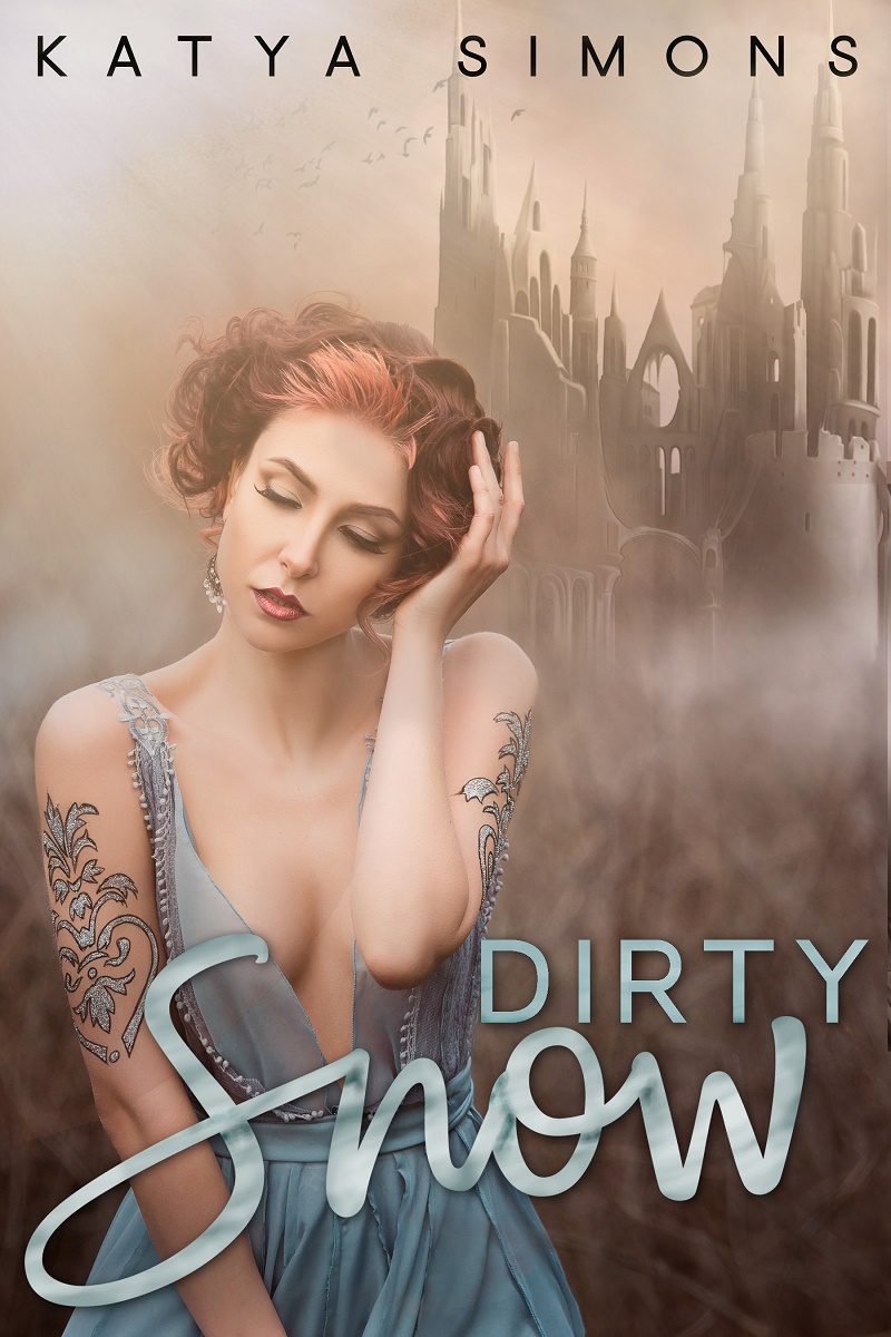
Dirty Snow is a contemporary erotic romance retelling of Snow White set in a made-up Kingdom. Target readers would be those who enjoy the stories of Madison Kaye and Nikki Sloane.

Nathan says:

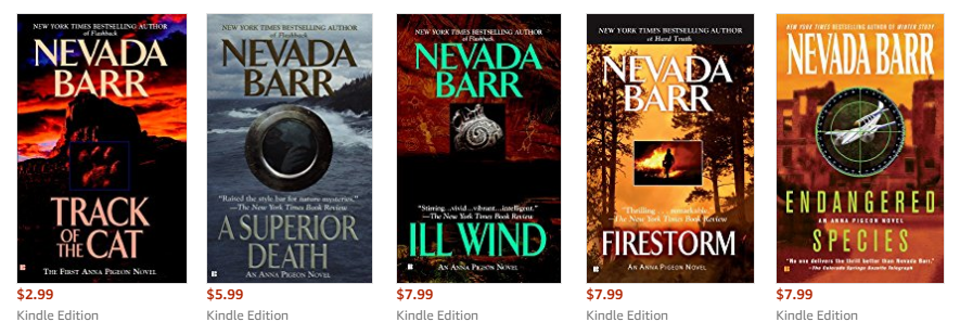
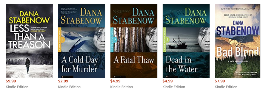
It’s a good cover, but I don’t think it would appeal to what you say is your target audience.  I couldn’t find Madison Kaye on Amazon (probably some funky variant spelling), but this is what came up for Nikki Sloane:

…which is pretty much what I think of when I hear “erotic romance”: people gettin’ it on. And yes, a couple of the covers crop out most of all of the face to concentrate on the bodies.

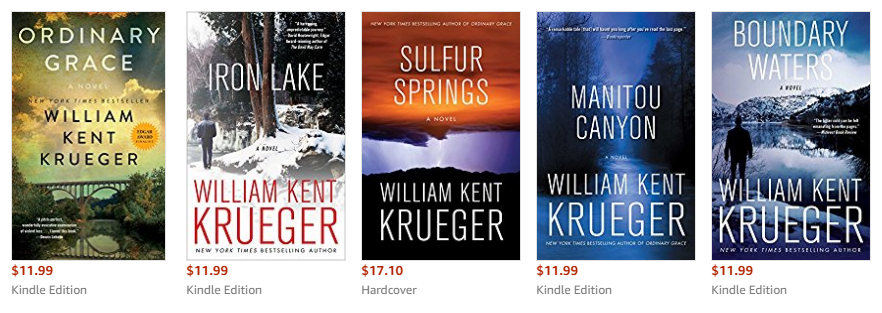
If you search “erotic romance fantasy” on Amazon, the covers are a little different: most of them concentrate on male torsos, not female figures (and yes, almost all of the men’s heads are cut off).  They also go bolder on the colors — bolder than your misty pastels, and the direct opposite of the monochrome images on Sloane’s covers.

So my takeaway here is: If I were to design the cover of an erotic fantasy romance that appeals to Nikki Sloane readers, I would use an image of a couple in an intimate position, but use deep, engaging colors.

Other comments?

Hunt

The author says:

This is for the first book in my YA urban fantasy series. I’m trying to go for a more urban fantasy/paranormal feel than the current cover. It’s set in the city and follows a teenage girl who has the power to control water and who is being chased by a Demon (she finds out later in the series that she’s an angel). It’s pretty comparable to the Mortal Instruments in tone and content.

Nathan says:

Having read the description, I can therefore make the connection that what I’m seeing around her is water.  However, for people who see the cover before they read the description, 98% of them will wonder if that’s some sort of bio-luminescent ectoplasm… and won’t click through to find out if they’re right.  Confusion does not equal interest.

I think you’re probably heading in the right direction overall, but you’re not there yet.  The model pose isn’t dynamic or active, the water doesn’t looks like water (as mentioned), the title font is a terribly dull Times-New-Roman-esque filler font (there’s only so much that filters and ornamentation can do to make a fundamentally boring font less boring), and the color scheme doesn’t look planned so much as discovered.

If I were hired to make a cover from this concept, I’d use stock photos of actual water that come up from the bottom as if the waves are magnetically attracted to her hands, find a font with just a titch of antique feel for the title (and extend it from side to side), and use the actual Mortal Instruments covers as a model for overlaying a consistent color scheme.

(Apropos of nothing: Chrome’s built-in spellchecker doesn’t know the word “ectoplasm,” but is just fine with “titch.”)

Other comments?

Double Dealing in Dubuque

The author says:

Double Dealing in Dubuque is a contemporary novel influenced by the noir mysteries of the past. Frank Dodge gets an assignment to write about the growing appetite for boutique food in the Midwest. When a fire breaks out at the food convention he’s attending in Dubuque, Iowa, two people die. Dodge suspects the real cause is being covered up by city officials. As he investigates, he gets drawn into a bitter dispute between two of the area’s craft food royalty, all while trying to fight off a rival writer intent on undermining his work. Double-Dealing in Dubuque delves into what can go wrong when feuds get out of hand. The book will appeal to fans of writers like Nevada Barr, William Kent Krueger, and Dana Stabenow. Peggy Nehmen created the cover art.

Nathan says:

I love it when submissions here include specific writers whose audience is the same audience.  That allows me to go to Amazon and see a gallery of their current covers.

Nevada Barr:

William Kent Krueger:

Dana Stabenow:

The first thing that jumps out at me? Crisp, clear, THIN contemporary fonts.  Stabenow’s are the only ones that even use any serif fonts, and even they are both clear and thin. My takeaway from this is that your faux-typewriter font isn’t going to signal to your target readers that this book is for them, and the distress on the title is another false step.

The second thing I see is a lot of high-contrast cover images, with the text both dominant and stark in its contrast with the image, whereas yours concentrates on midtones and avoids areas of high contrast.

The third thing I see is that only seven of the fifteen covers above feature a human figure at all, and the only ones that could be said to feature a “portrait” are Stabenow’s “Kate Shugak” series book — and a little bit of checking shows me that those are reissue covers, not the covers that originally introduced the character.  So I’m going to say from those examples that having fully a third of your cover space taken up with the bust portrait of the dude with the hat is the wrong way to go.

Your designer obviously has the technical skills to put a cover together; now you need to put your heads together to come up with a cover concept which targets your intended audience.

Other comments?

The Psychic and the Priest

The author says:

Hidden truths and new found strength have brought this unlikely pair together, and together Annie and Asha are a powerful duo. But will their magic be enough to take on an evil seeking vengeance, willing to do anything to get what they want, even if it means making a deal with the devil himself. Even with new revelations unfolding and new alliances being formed, going up against the powerful demon, Damarcus won’t be easy. Sacrifices will need to be made, lines will be crossed and loved ones will meet their demise as they take on evil in hopes of saving their kind and each other. Will they win or will they meet their demise?

Nathan says:

You’ve got the basics down, but the execution has some problems.

  1. While the byline is clearly readable in thumbnail, only the main words of the title are; I think just about anybody who saw the thumbnail first would conclude the title is “Psychic Priest.”
  2. The overlapping faces are confusing; the male face is cut off at his left cheek, as if the female face were in in the foreground — but the male face is so much bigger, the brain says, “Wait a sec, that can’t be right…”  The demon merely becomes “image noise” at thumbnail, and the other unidentifiable lays just make it murkier.
  3. Neither your cover nor your description give me any idea of setting.  Is this contemporary urban fantasy?  Second-world fantasy?  Historical fantasy?  Is this a pastoral or an urban setting?  A large part of the appeal of fantasy is the milieu against which the magical events take place — somewhere, you gotta give that to the potential reader.  (And there’s a lot of other text in your description which basically means, “Stuff happens, but I’m not gonna tell you about it here” — you could excise that to make room for some concrete details.)

Other comments?

The White Raven

The author says:

The White Raven is contemporary fantasy/magical realism with just a splash of romance about a cursed witch, set in modern times, who is shadowed by a white raven. The main plot deals with the mysterious connection between the heroine and the white raven, and whether it’s the cause of her curse or the instrument of her release. It’s an adult novel targeted to women mostly. **This cover is a draft to replace my existing cover that I already know is not working.**

Nathan says:

I love it.

Seriously.

The only things I would be tempted to do are (1) find a way to make the byline clearer in thumbnail, either by increasing the contrast or enlarging it a little bit, and (2) making the white raven emerging from the back of her head (now there’s a phrase I never expected to have occasion to write) just a little bigger, so that it “reads” as a bird easier in thumbnail.

But I love it.

Other comments?