The author says:
True Colours of the Chameleon is a modern crime/romance novel. An unemployable research scientist ‘Doc’ becomes a drug producer and forensic advisor in a criminal gang and befriends master of forgeries and disguises ‘Chameleon (Cam)’. When the Birmingham Seven’s heist of the Blue Moon Casino goes wrong, Doc and Cam end up on the run together with the spoils. They’re pursued not only by the police, but by two of their old comrades who want Doc and Cam out of the picture on account of them being witnesses to a murder. Doc is pushed to her limits when she is called upon to kill to defend herself and Cam, and it becomes apparent Cam is keeping a dreadful secret about his past from her that threatens to shatter her trust in him. As the law and their other enemies close in on them, they must overcome these barriers if there is to be any hope for their survival.
Nathan says:
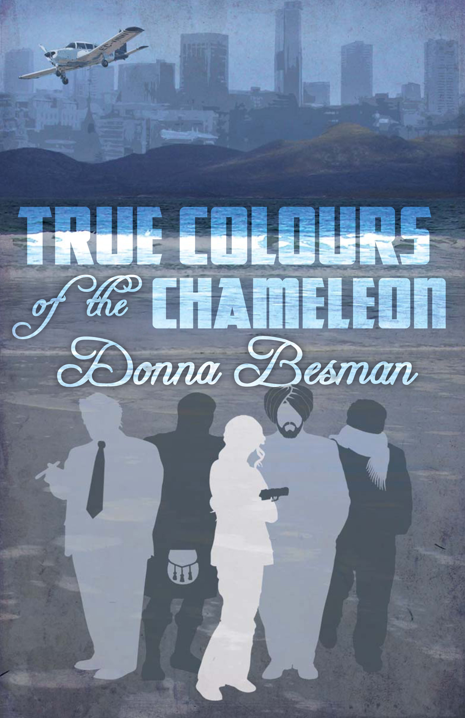
I’m okay with all the elements. I don’t like where they are.
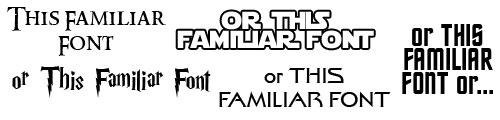
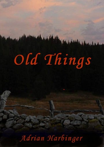
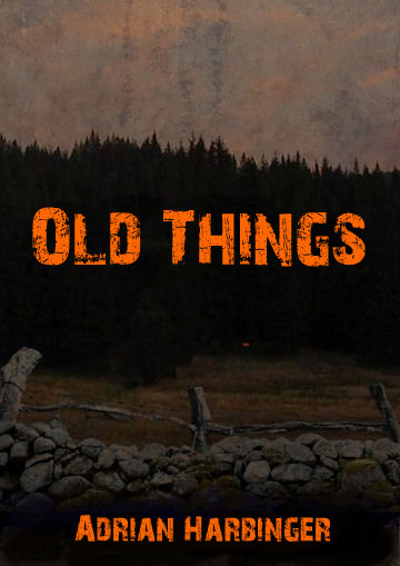
The way things are arranged now, you’ve got a top half with plenty of detail/texture, and a bottom half in flat silhouettes. As you can see in the thumbnail, the bottom two thirds ends up looking dull by comparison.
The first thing I’d try is moving the silhouettes up to the middle so they overlap into the top image, and move all of the text to the bottom. You’d have a visually intricate top and bottom, and the silhouettes in the middle, by virtue of them now being a focal point, won’t seem like an afterthought. (Without actually doing it, I’m not sure how well that would work — I’m a tinkerer when I design — but it certainly seems like it would be worth doing.)
Other thoughts?