A useful starting place for using typography on your book cover:
Category: Design 101
Design 101 is an occasional series of design tips for non-professionals designing their own book covers.
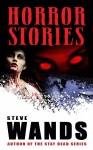
Once upon a time, there was a book published called The Great Gatsby. It looked something like this:
![cover[1]](https://covercritics.com/wp-content/uploads/2014/03/cover11.jpg)
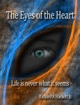
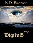
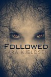
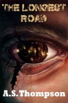
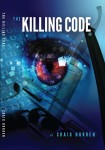
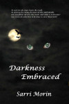
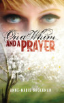
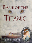
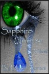
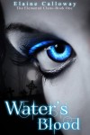
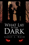
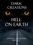
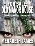
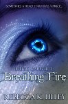
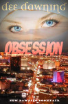
Actually, it looked pretty much exactly like this, because since it was first published in 1925, this has been the cover illustration on just about every edition. That’s not just unusual; it’s stupendous. I don’t know if this was the first cover art that used the “floating eyes” visual motif (note: yes, there are also floating lips, but the eyes are what everyone sees), but the fact that this cover has remained the cover for the book might give you an indication of just how powerful a design motif that is.
However.
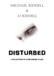
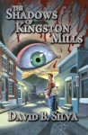
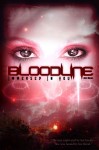
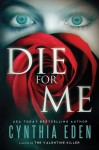
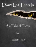
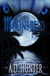
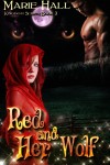
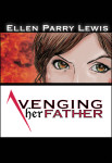
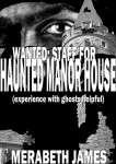
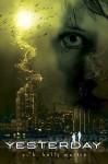
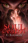
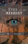
What was once powerful can easily become a cliche once everyone starts doing it, especially when people new to a particular arena (like, say, indie writers who are doing their own covers with little experience) don’t realize just how common it is. So while it is indeed possible for an experienced professional illustrator to use a “floating eyes” motif, if you are coming to this site for advice then you do not qualify as an experienced professional illustrator.
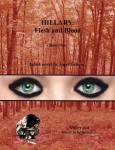
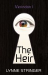
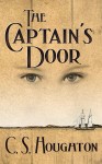
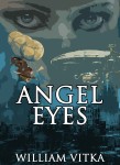
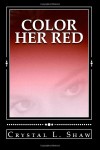
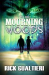
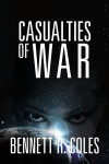
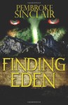
How common is it? I used to update a tumblr called Floating Eyes, featuring nothing but book covers featuring, yes, floating eyes. I stopped updating it not because I had run out of material — far from it! — but because I was finding it impossible to distinguish covers I had already posted from new ones. And that, really, is the point: It’s become a common cliche, a bit of graphic filler that does nothing to distinguish your book.
In the interests of proving my point, and because you might not click through that link, here is the FIRST 100 covers on that tumblog:

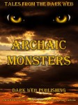
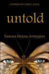
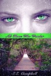
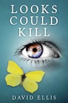


My point, I trust, is made.
Design 101 is an occasional series of design tips for non-professionals designing their own book covers.
We writers are used to saying what we want to say with the words we write. But when words are on the cover of your book — in the title, the byline, a tagline or blurb — what the words say is no more important than how they say it: the font in which the text is rendered is an important part of the design of the cover as a whole, at least as important as the artwork.
Now, learning exactly how to incorporate type into your designs is beyond the scope of this post. Mostly, I want to warn you away from some of the worst possible font choices when you start assembling your cover. Ready? Let’s go:
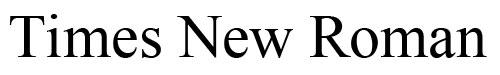
Seriously, this is the most common font in the world, thanks to it having been the default font in just about every word processor for the past thirty years. People recognize it, even if they don’t realize they do, and it implies to them that the book cover on which it appears is actually a term paper that was slapped together at the last minute.
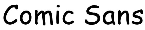
No. Just no. This began life as an ugly font (the lines are drawn at weird angle, and the letter spacing and the use of serifs is inconsistent), and its as a free font in most versions of Microsoft Word meant that it was the nearest thing to hand when people quickly wanted to make text a bit frivolous or childlike or “fun.” It has inspired a backlash of hatred (google “Comics Sans” to see what I mean), to the point that you can’t even use it ironically (whatever that means).

At one point, this would have been an acceptable font to use (although there are persistent kerning problems between uppercase and lowercase letters — see the gap between the uppercase “P” and the lowercase “a”?). Unfortunately, it has been so overused — and used poorly (see the kerning note above) — that only amateurs use it now.

Impact used to be a useful font. But again, overuse took it away from us — specifically, its use in thousands upon thousands of LOLcats and other captioned memes. That association has crippled its use in non-funny, non-internet-self-referential situations, especially in white with a black border.
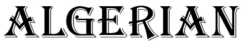
Otherwise known as “that royal font.” This gets used a lot on fantasy novels by self-publishers who don’t realize that it’s (a) not as pretty as it looks at first glance — it’s kind of boring, really, especially because it’s all-caps — and (b) it’s terribly overused, especially on self-published fantasy novels.
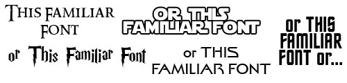
Here’s a tip: If a font is intimately associated with a media property with its own rabid fandom, the immediate recognition of that font will not help you. At best, your book will be assumed to be a parody of said property (and since all of those properties have plenty of lame-but-unintentionally-laughable self-published ripoffs, why would anyone want an intentionally laughable one?); more likely, yours will be assumed to be one of those lame-but-unintentionally-laughable ripoffs just mentioned.
And now, if you’ll excuse me, I have several fonts which I installed specifically to make these examples which I now want to wipe from my computer.